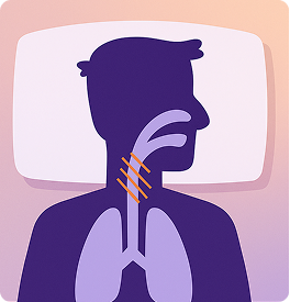
OSA
Obstructive sleep apnea
The most common form — the upper airway physically collapses or is blocked, restricting oxygen even as the body keeps trying to breathe.
Nocta / AI CPAP Companion
Nocta reads a CPAP machine's overnight data and writes one honest, plain-language story — what happened, what likely caused it, and the single next thing to try.
01 · The condition
Sleep apnea is a disorder in which breathing repeatedly stops and starts during sleep. Pauses can last from a few seconds to minutes and may happen hundreds of times a night — fragmenting sleep and starving the body of oxygen. There are two main types.
The most common form — the upper airway physically collapses or is blocked, restricting oxygen even as the body keeps trying to breathe.
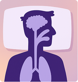
Less common and harder to spot — the part of the brain that controls breathing misses a beat, so the body simply doesn't try to breathe.
02 · The device
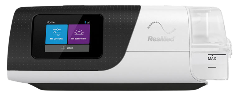
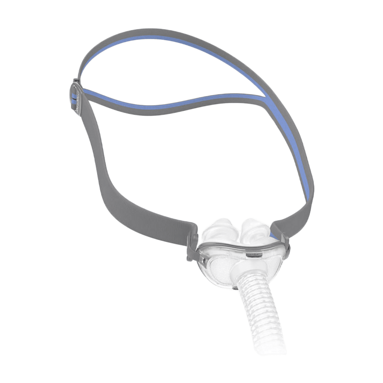
CPAP — Continuous Positive Airway Pressure — delivers a steady stream of pressurized air through a mask worn over the nose or mouth, splinting the airway open through the night. Pressure and timing are tuned to the patient, and the machine quietly logs every breath it delivers.
The machines
The masks — fit is everything
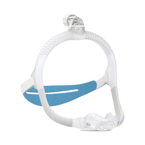
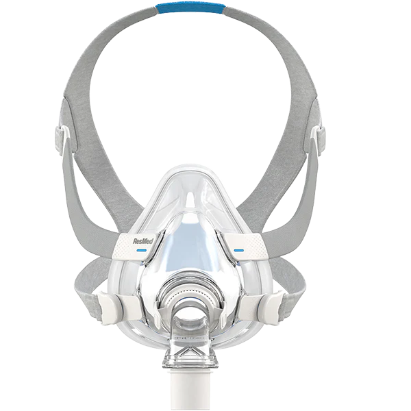
03 · The stakes
Compliance is how consistently you use the machine as prescribed. Insurers define it with a hard threshold — and it's where most people fall off, often without realizing the clock is running.
01 Desk Research
Sleep apnea affects an estimated 3 to 9% of adults, close to a billion people worldwide. CPAP, the gold-standard treatment, has an adherence problem: a 20-year review found adherence hasn't meaningfully improved, despite better machines and coaching programs.
people affected worldwide
adults have moderate - severe sleep apnea
still met the insurer standard (4+ hours on 70% of nights) two years in
of patients on track in their first month were still on track two years later
Community Research
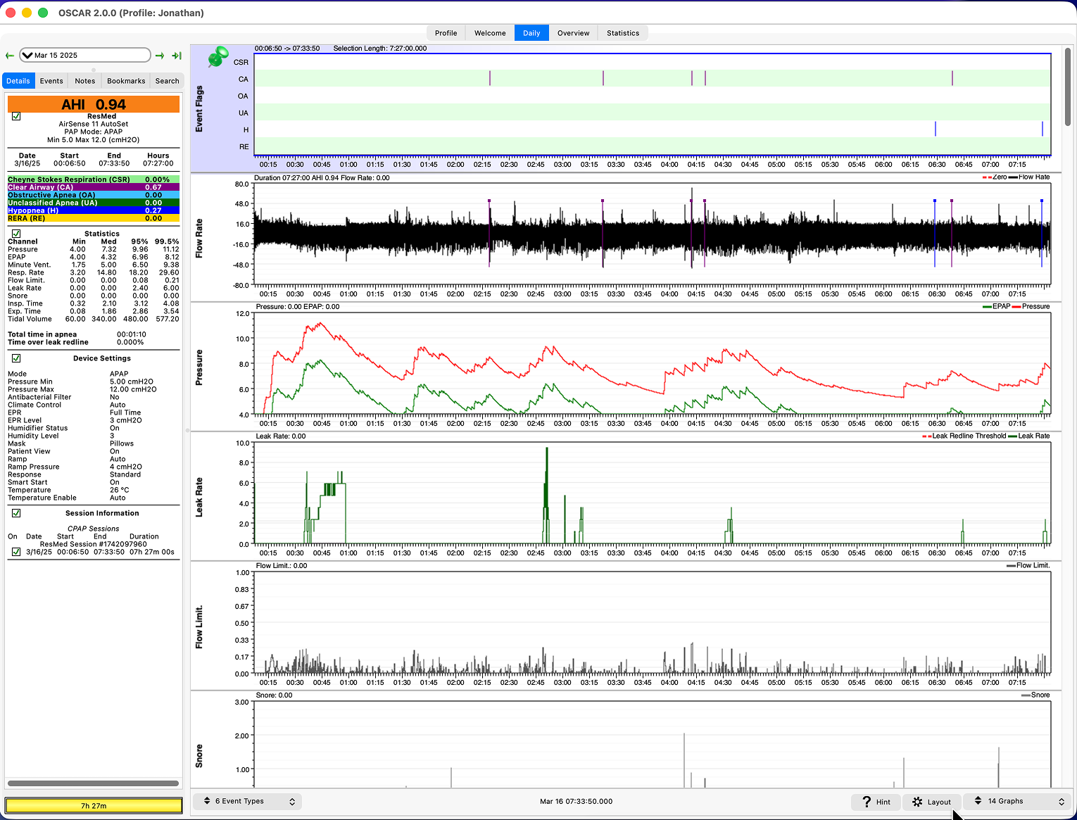
Beyond the studies, I read through r/CPAP and r/SleepApnea — the human side of those numbers. Post after post described the same struggle: drowning in raw numbers, fighting clunky tools like OSCAR, and just wanting someone to explain what it all means.
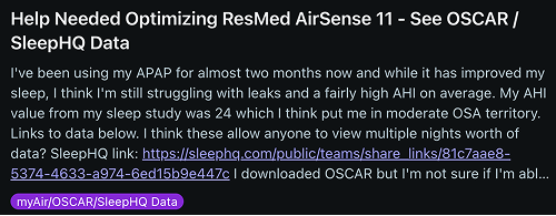
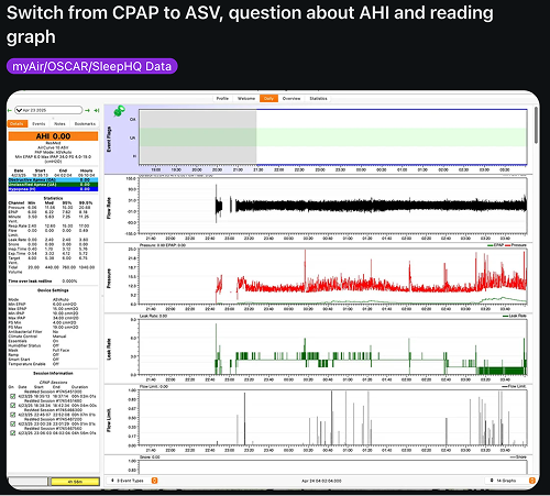
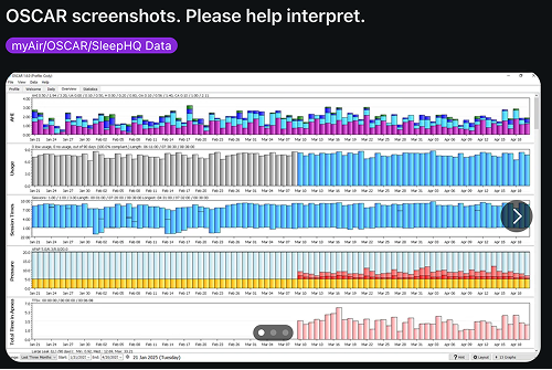
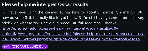
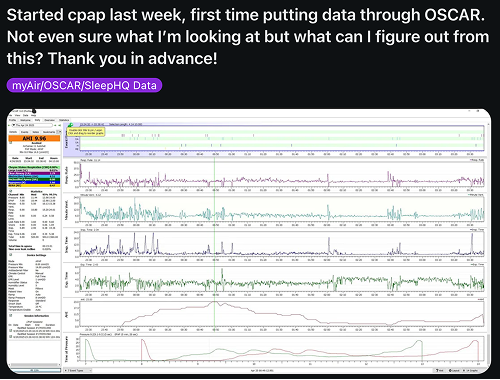
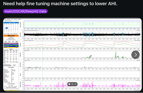
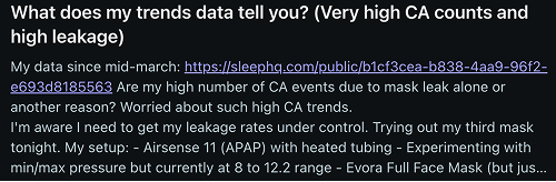
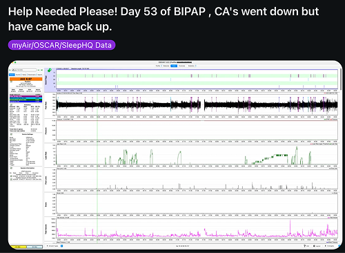
Underneath the frustration, the same quiet hope kept surfacing —
User survey · 14 CPAP users
named mask air leaks as one of their biggest challenges
had already changed their mask style or size
rated mask comfort as the #1 thing they'd change
wanted more guidance and better tracking on therapy
User Interviews
I sat down with six people who actually wear the mask every night — an engineer, a veteran, a self-treating researcher, a designer, a retired lawyer, and a long-haul trucker. Very different lives, strikingly similar frustrations.
Kathy L.
Software Engineer · Portland
Wished out loud for a “CPAP virtual assistant” that gives tips for her specific issues.
ResMed F40 · OSA · myAir + SleepHQ
Cody F.
Veteran & Student
myAir's averaged-out data hides what actually happened overnight.
Memory-foam mask · Moderate OSA · myAir
Susan J.
Self-treating researcher
Self-tunes with OSCAR, Python & ChatGPT — wants longitudinal depth and autonomy.
Full-face mask · UARS · OSCAR
Miles R.
Product Designer · San Francisco
It shouldn't feel so medical — therapy should feel personal.
Nasal pillow · OSA + CSA · MyBreeze + SleepHQ + OSCAR
Robert T.
Lawyer, 66
A comfortable mask is what makes compliance actually stick.
ResMed full-face mask · Severe OSA · myAir
Marcus B.
Long-haul Trucker · Ohio
I need to know I'm passing compliance — my CDL depends on it.
Nasal pillow · OSA · myAir
What I heard, again and again
Nearly everyone cycled through many masks (Kathy tried nine) before one stuck — and discomfort is exactly where people quit.
myAir felt too shallow; OSCAR too complex. Everyone wanted the missing middle — real detail, without the overwhelm.
From “virtual assistant” to ChatGPT consults, users already reach for AI to interpret the data and say what to try next.
Compliance pressure makes therapy feel like being a medical device. People wanted warmth, autonomy, and encouragement.
02 The Problem
CPAP apps swing between two failures: they bury patients under raw charts, or they hide the data entirely behind a single green checkmark. Neither builds the confidence and curiosity that keep someone wearing an uncomfortable mask night after night — so most stop within the first month.
The Opportunity
“How might we make CPAP data feel actionable and human — so people feel guided, not graded?”
The Solution
Distill each night into one story — what happened, what likely caused it, and the next thing to try — wrapped in calm charts and wearable context.
Competitive Analysis
I scanned the apps people already use: the CPAP-specific tools built for the data, and the consumer wellness apps built for the habit. The gap between the two — clinical depth with a human voice — is where Nocta lives.
Direct · CPAP & sleep-data tools
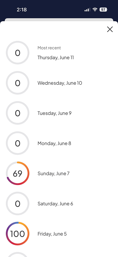
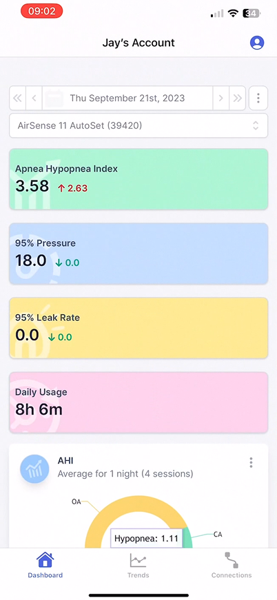
ResMed myAir
The official app — one nightly score, little of the “why”.
SleepHQ
Deep CPAP analytics — powerful, but built for power users.
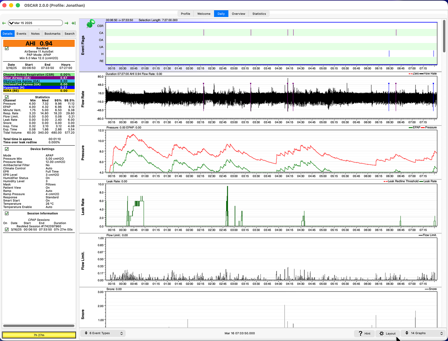
OSCAR
Free desktop software — every data point, zero guidance.
Indirect · Consumer wellness & wearables
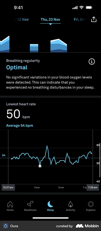
Oura
Beautiful readiness scores — but blind to CPAP.
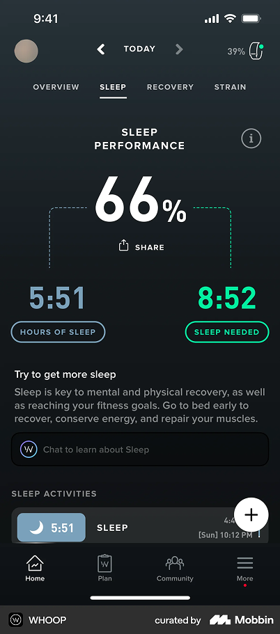
Whoop
Strain & recovery, gorgeously visualized and habit-forming.
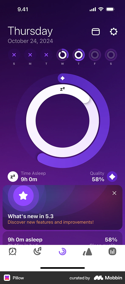
Pillow
Friendly iOS sleep tracking — warm, but light on depth.
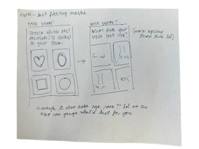
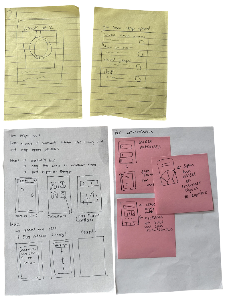
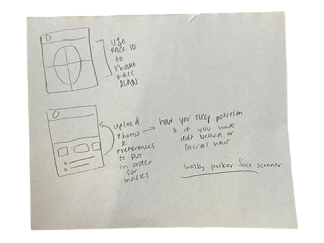
Before the pixels
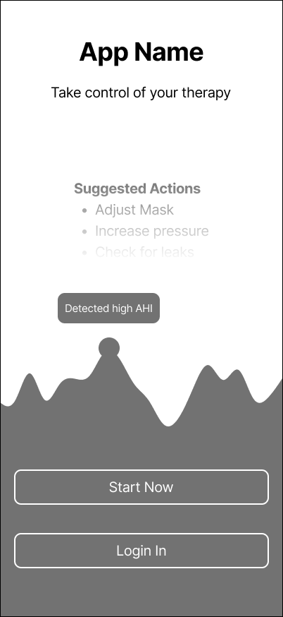
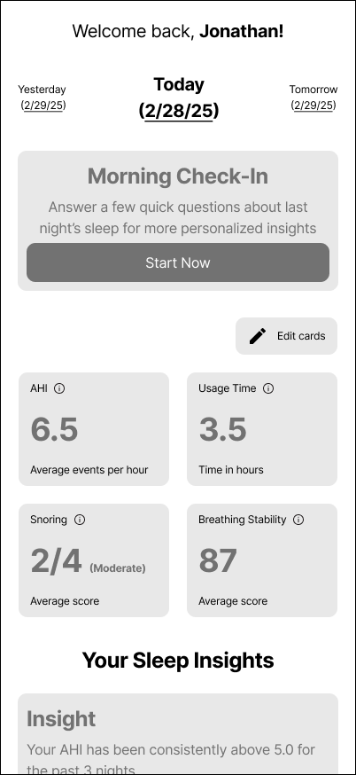
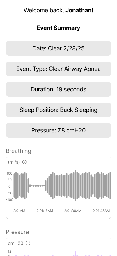
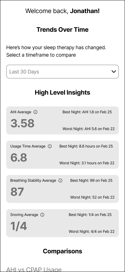
Before opening Figma I sketched widely on paper — many rough takes on the nightly story, the dashboard, and how a single number should feel. Most were wrong, which was exactly the point: cheap to draw, cheap to throw away.
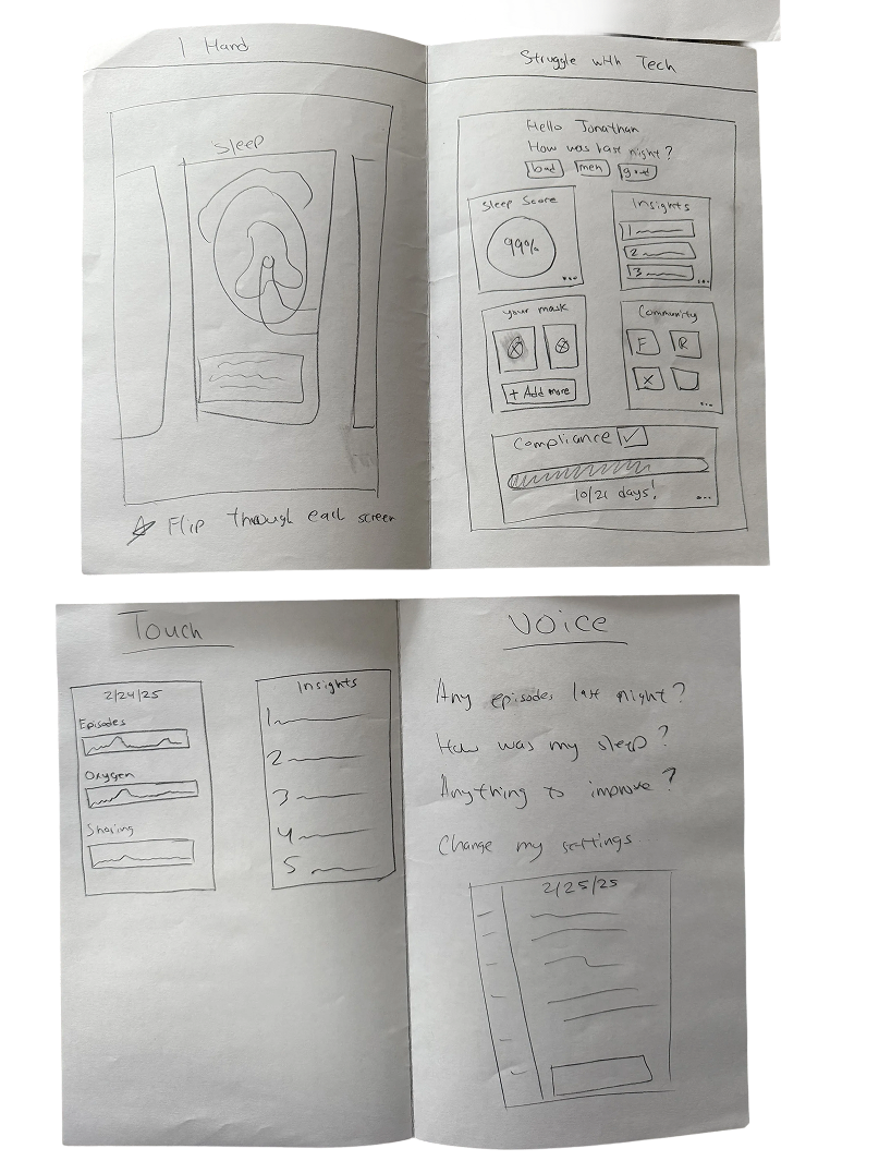
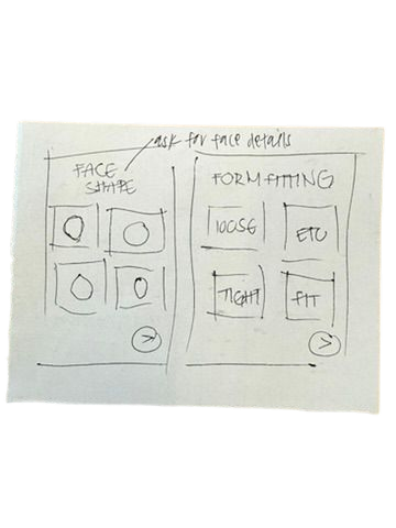
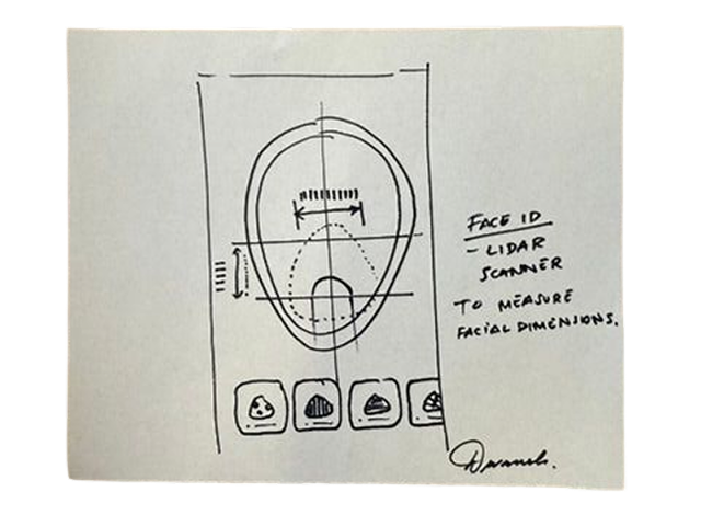
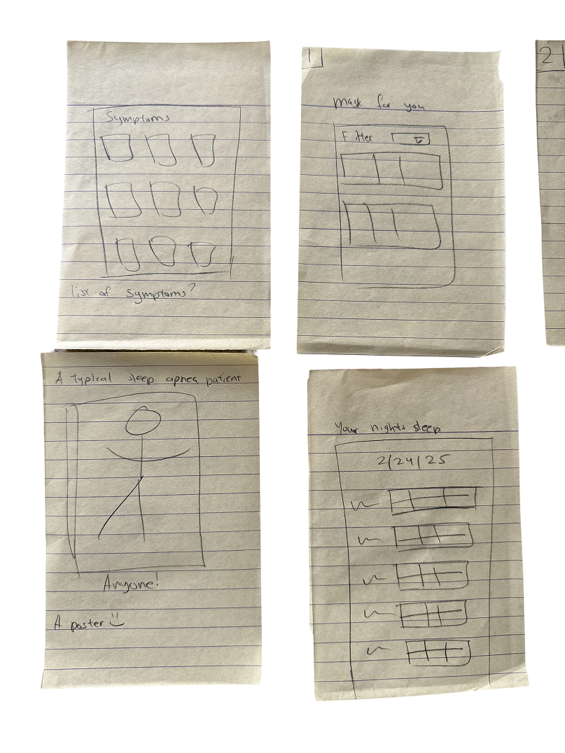
Iterations
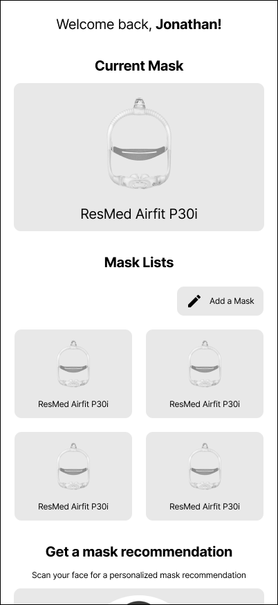
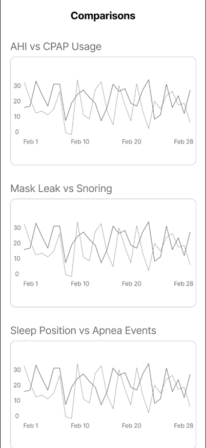
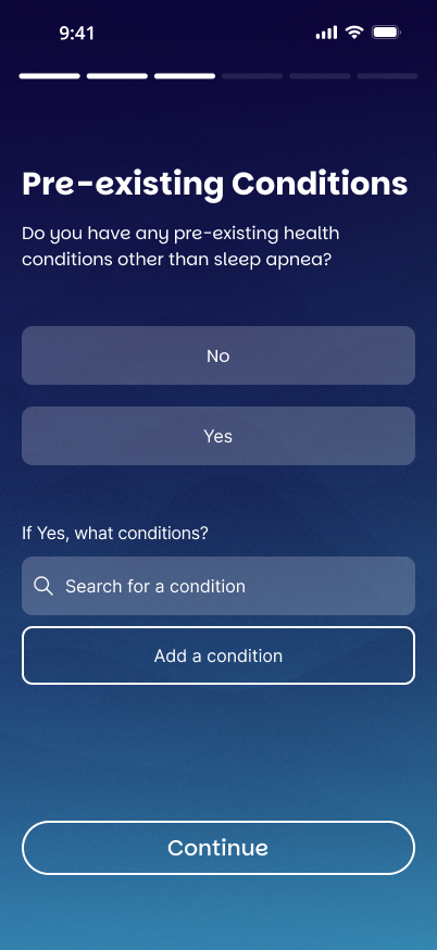
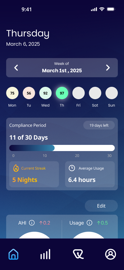
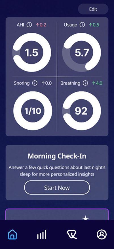
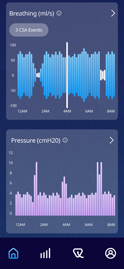
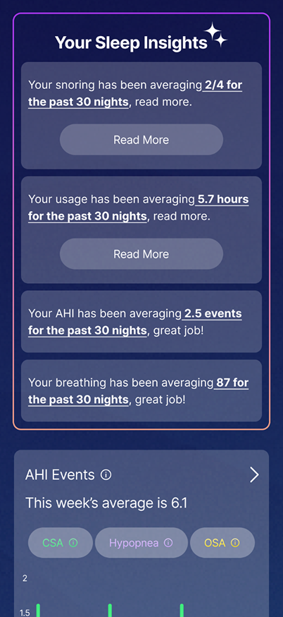
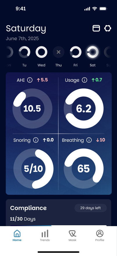
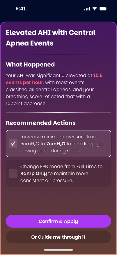
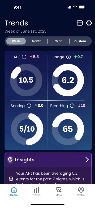
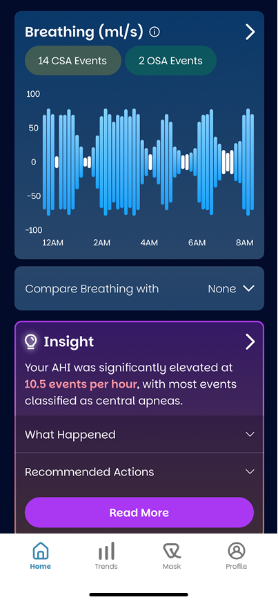
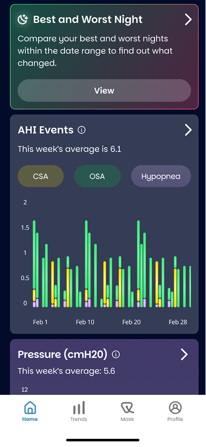
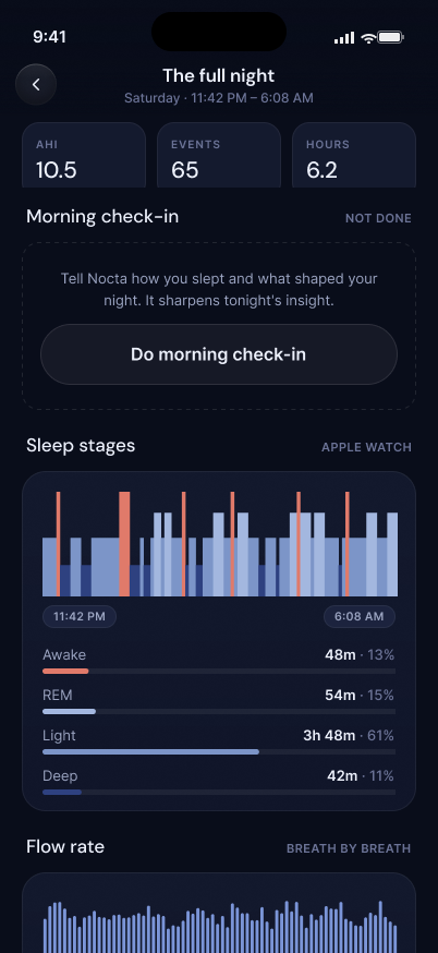
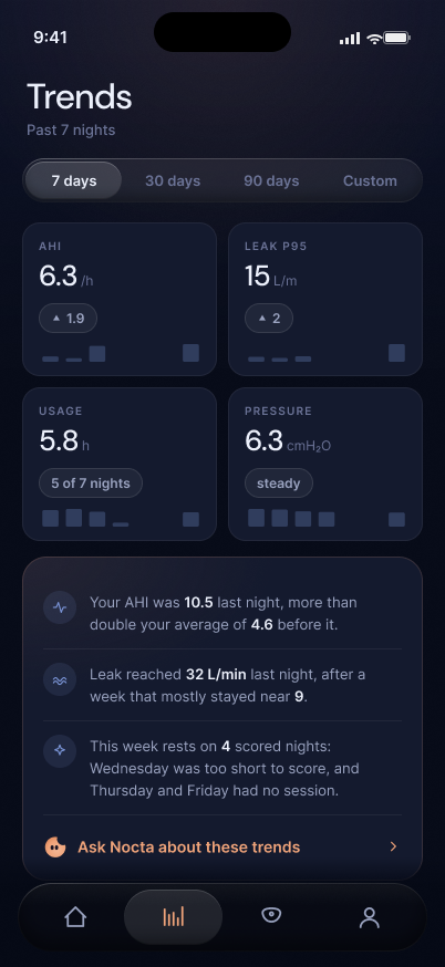
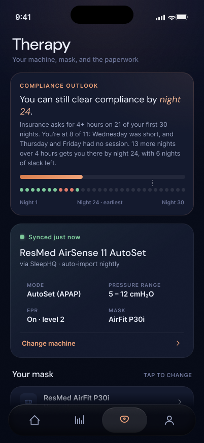
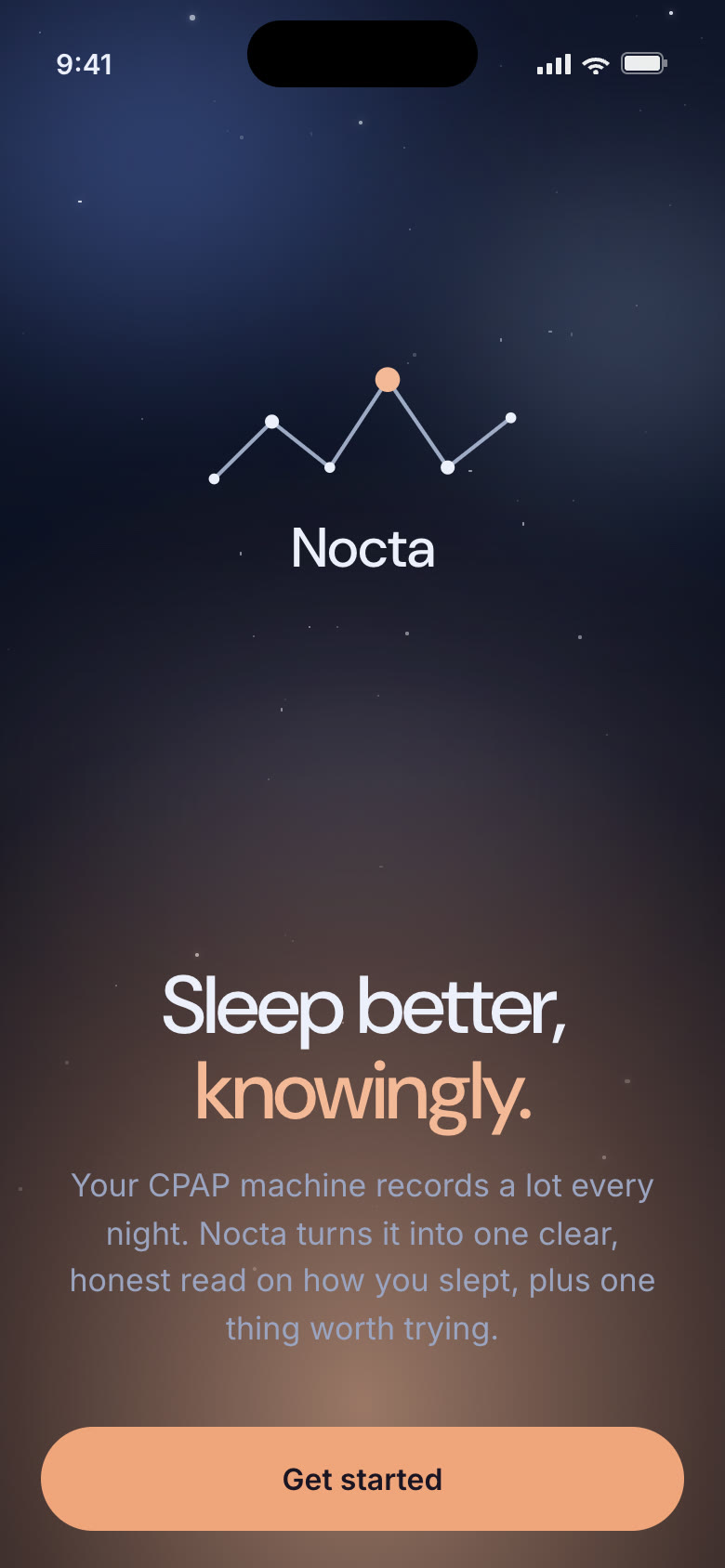
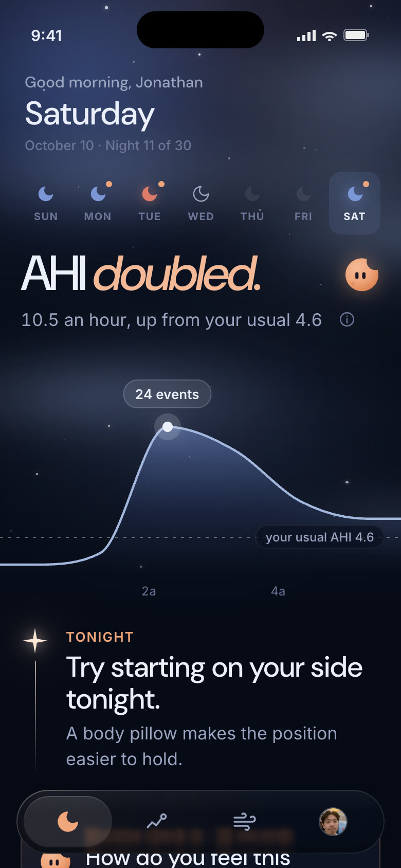
Back in March 2025, Nocta was my grad-school capstone — researched, designed, and built entirely by hand, no AI in the loop. Each pass clarified the hierarchy and warmed the palette, moving from grey wireframes toward a darker, calmer system. In 2026 I took V3 into code and kept designing in the browser. V4 rebuilt the core screens around one card that explains the night; the final iteration adds the night sky, Nox and the why horizon.

03 Brand & Design System
Most CPAP tools look like the machine they came from: grey, clinical, scored in red and green. Nocta's brand starts from the moment people actually open it: half-awake, in the dark, a little worried about a number. The name, the logo, the sky, the coach and the voice all work toward one thing: lowering that worry.
The name
Nocta
nox, noctis · Latin for night
01 · 2025 capstone
02 · Mid 2025
03 · 2026 exploration
04 · Final
At every size
 Nocta
Nocta
Found in the sky
Meet Nox
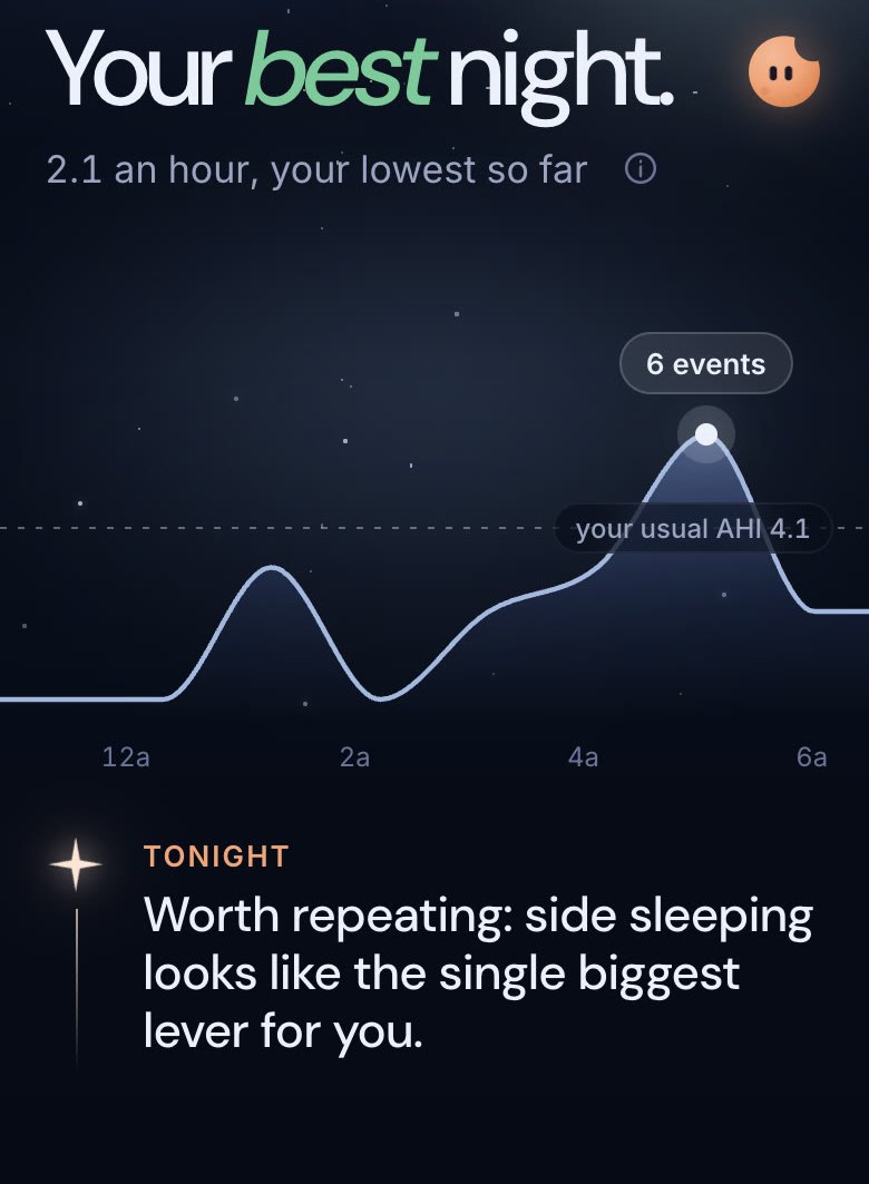
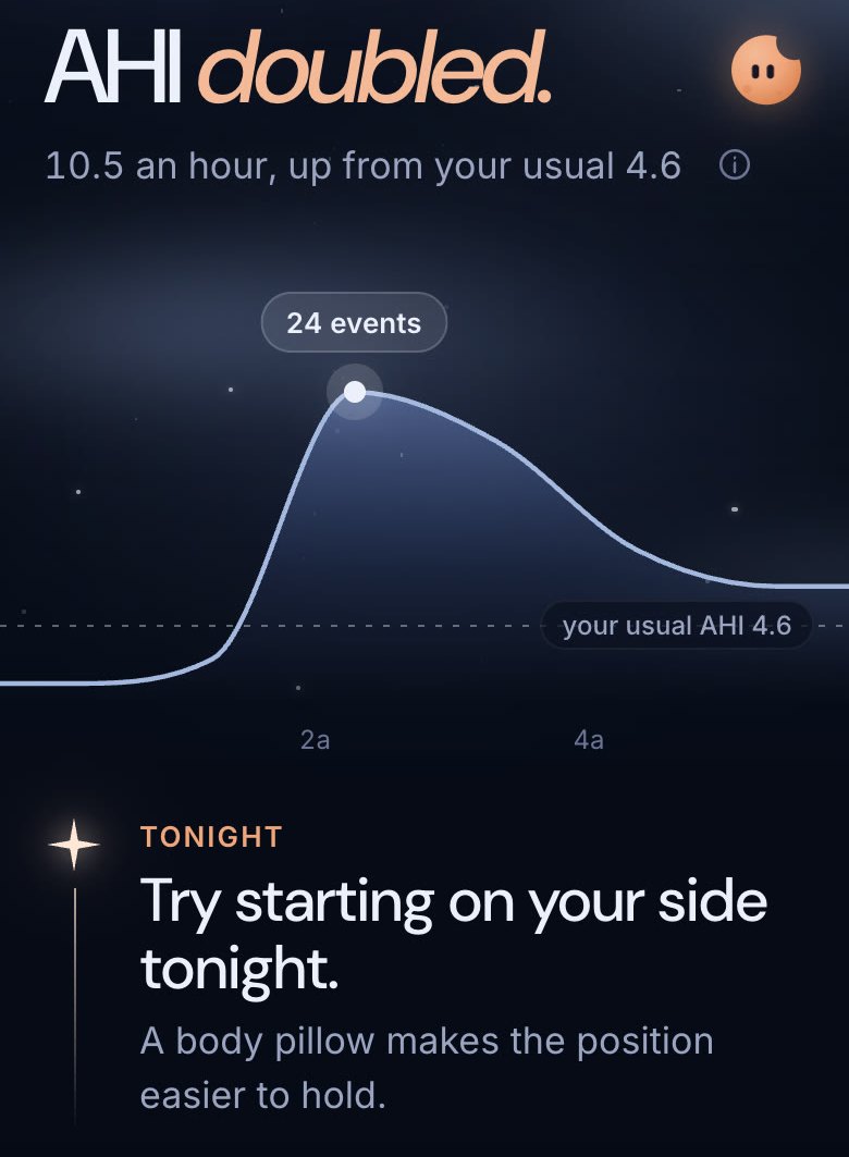
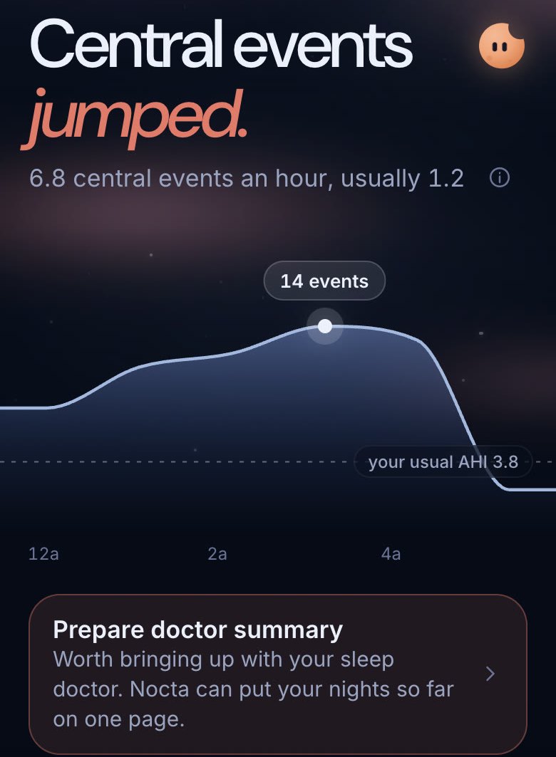
Like the Weather app, the sky behind Tonight changes with the night you had. The condition comes from the night's insight: clear, bright, hazy, overcast, or faint when there's too little data. It changes the mood, never into a traffic light.
Palette
#090D1A#141A2E#7B95D8#F0A47A#E07A6ATypeface
The Result · Today
04 Features
01
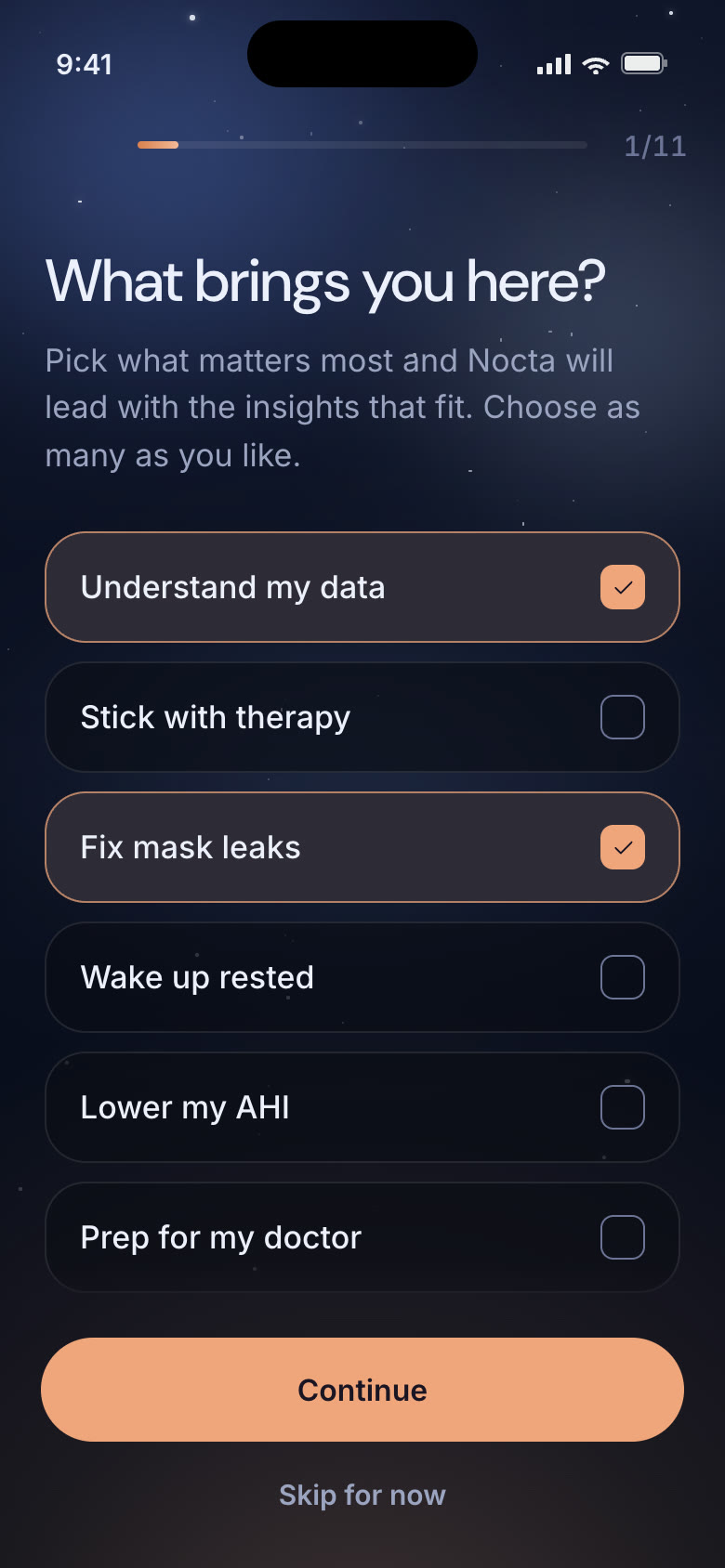
New CPAP users arrive anxious and short on patience. Setup only asks what changes how Nocta reads a night (goals, sleeping position, other conditions, mask, insurance window), then sets expectations before night one.
02
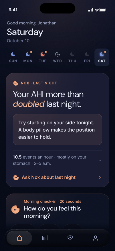
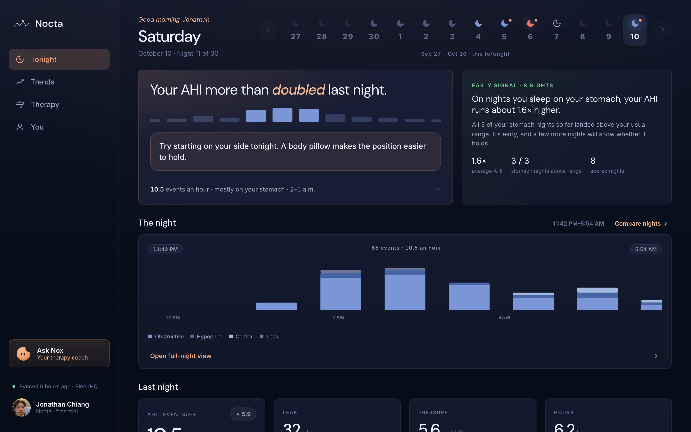
Instead of a wall of charts, the first thing you see is a verdict and the shape of your night: a few words on what happened, one line with a reference point, and a curve of events per hour against your usual.
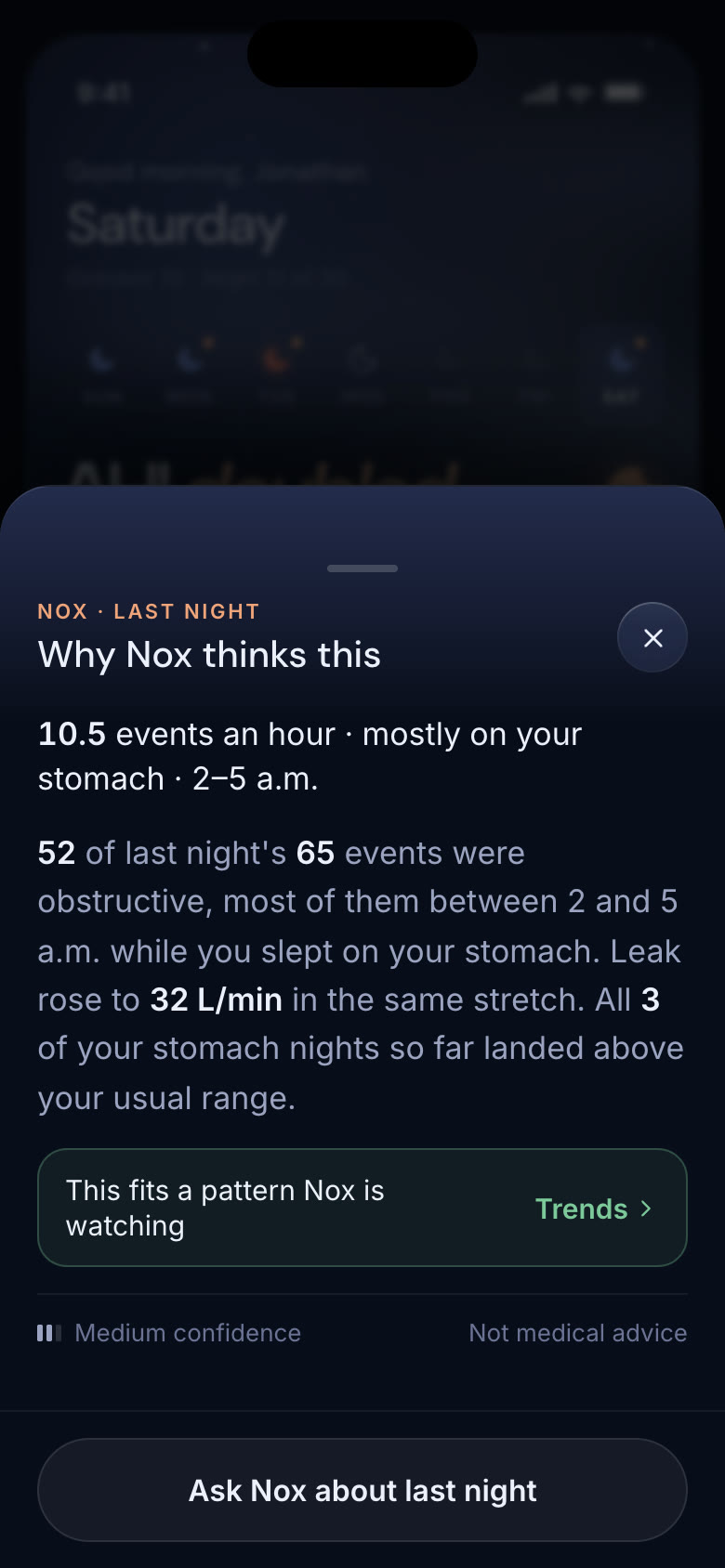
Tap the info icon and Nox shows its work: the exact numbers it reasoned from, whether the night fits a pattern it's watching, and how confident it is.
03
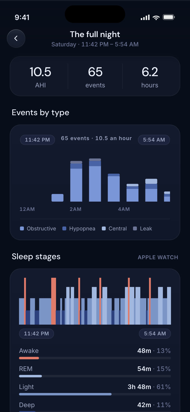
The detail layer: events by type on the night's real clock, sleep stages from your watch, and the machine's four signals (flow, pressure, leak and snore).
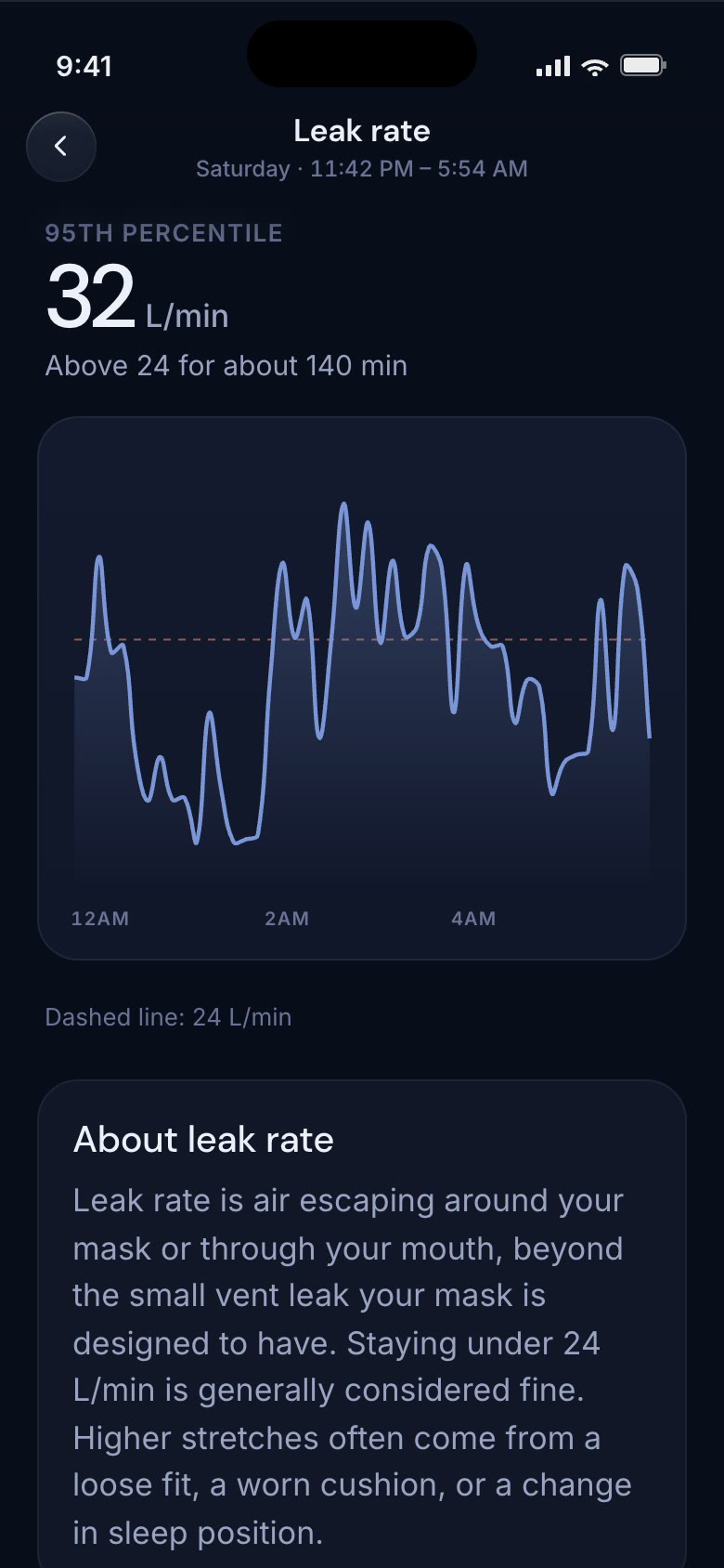
Tap any chart for its own page, like Apple Health: the key number, the graph at full size, and a plain-language “About.”
04
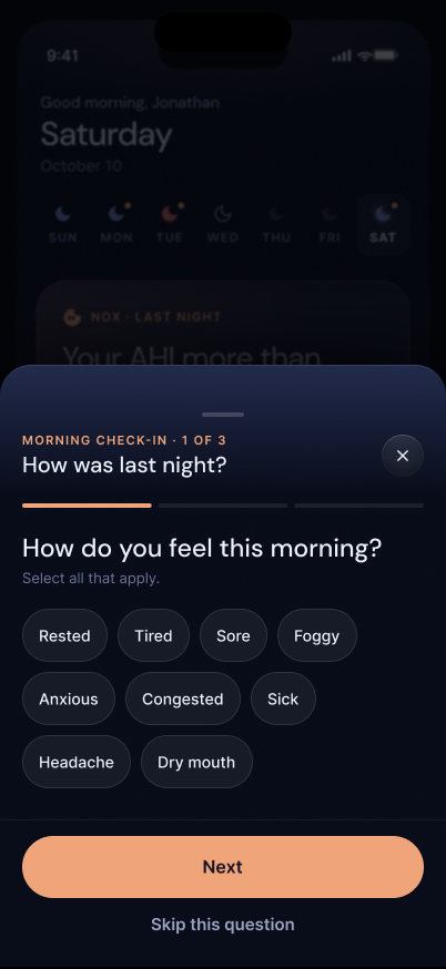
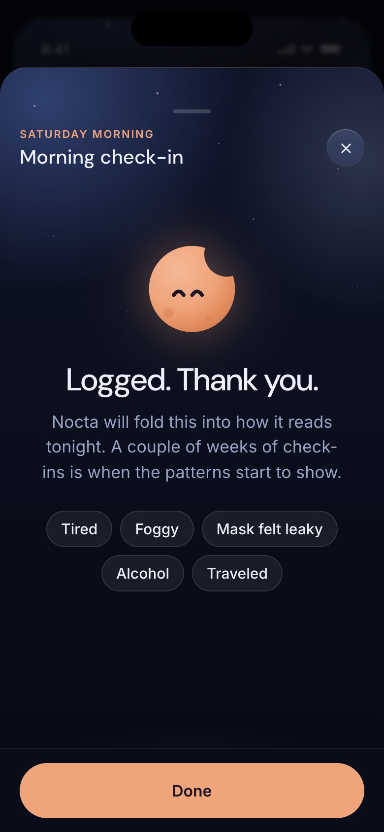
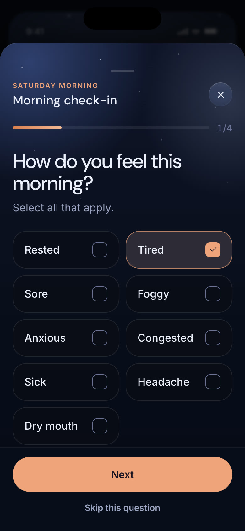
How you felt and what happened that day is half of what Nox learns from, so the check-in sits right under tonight's suggestion. The first question is answerable in place: tap “Tired” and the rest opens with it already picked.
Four questions, with back and skip on every step. Once it's logged, it folds down to a single slim line.
05
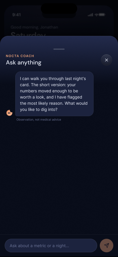
Nox opens already knowing what you were looking at. From the horizon it starts with last night's numbers and offers three follow-ups; from Trends or a chart, it starts there instead.
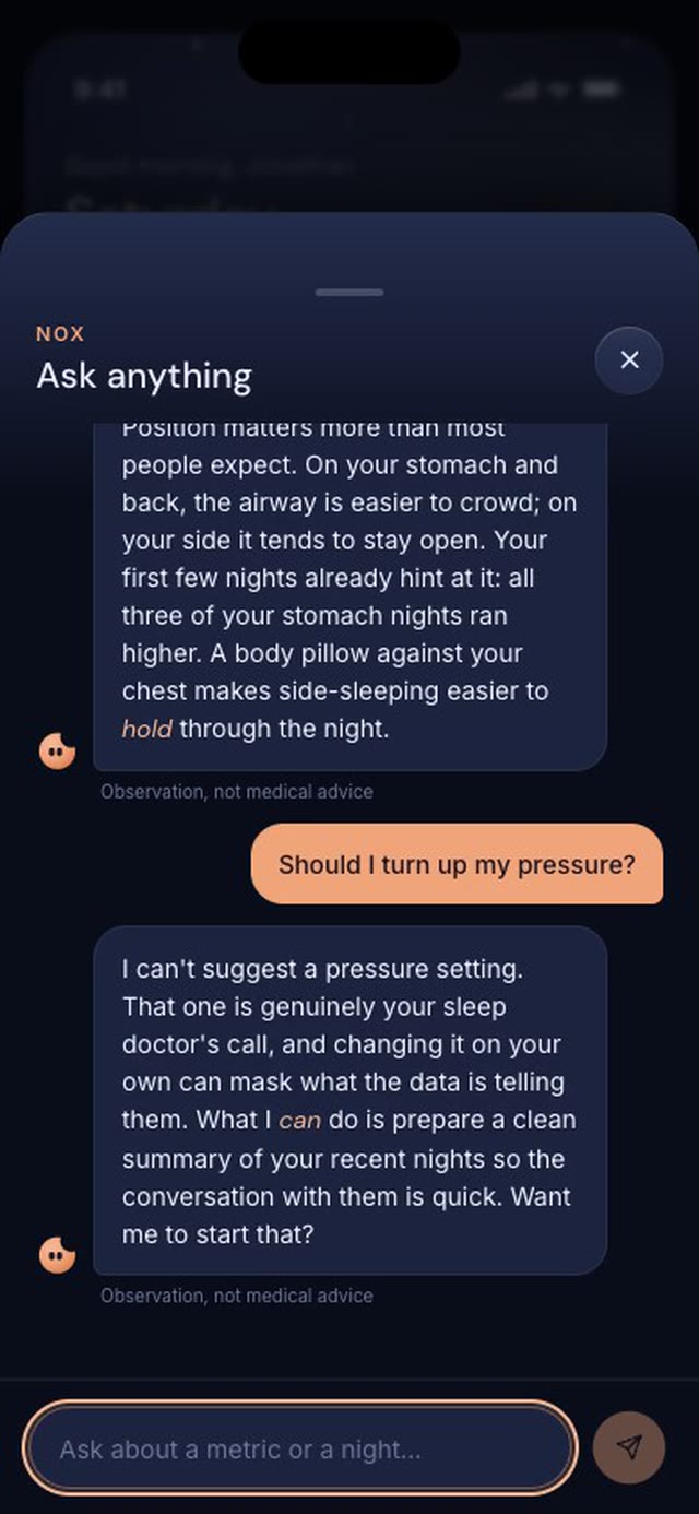
Its limits are part of the design. Ask it to change your pressure and it says that's your doctor's call, then offers to prepare a summary for them.
06
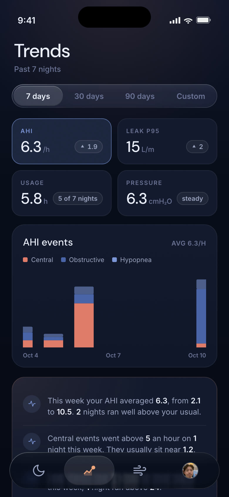
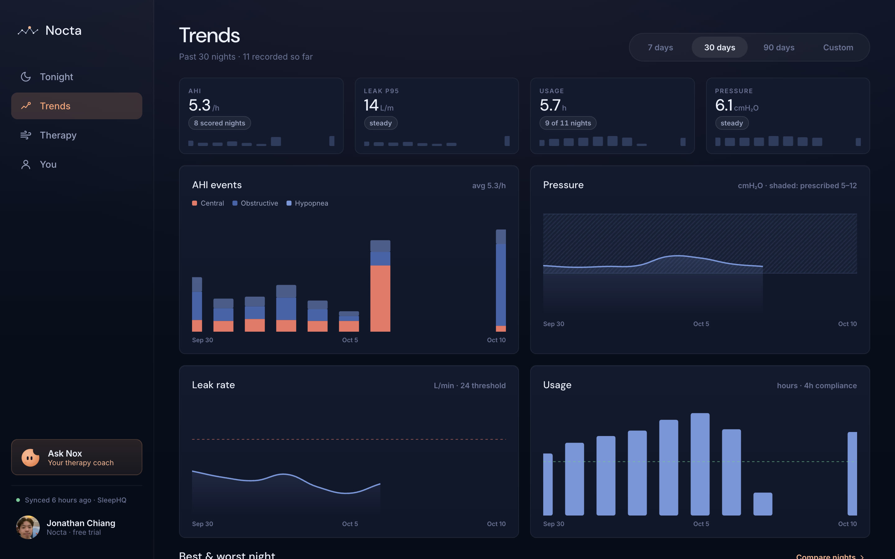
Zoom out to 7, 30 or 90 nights. Four tiles (AHI, leak, usage and pressure) double as tabs for one large chart, each with its change right beside the number.
Week-level insights, a best-versus-worst night comparison and journal patterns connect what you logged to how you slept.
07
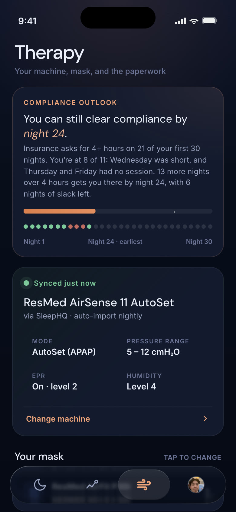
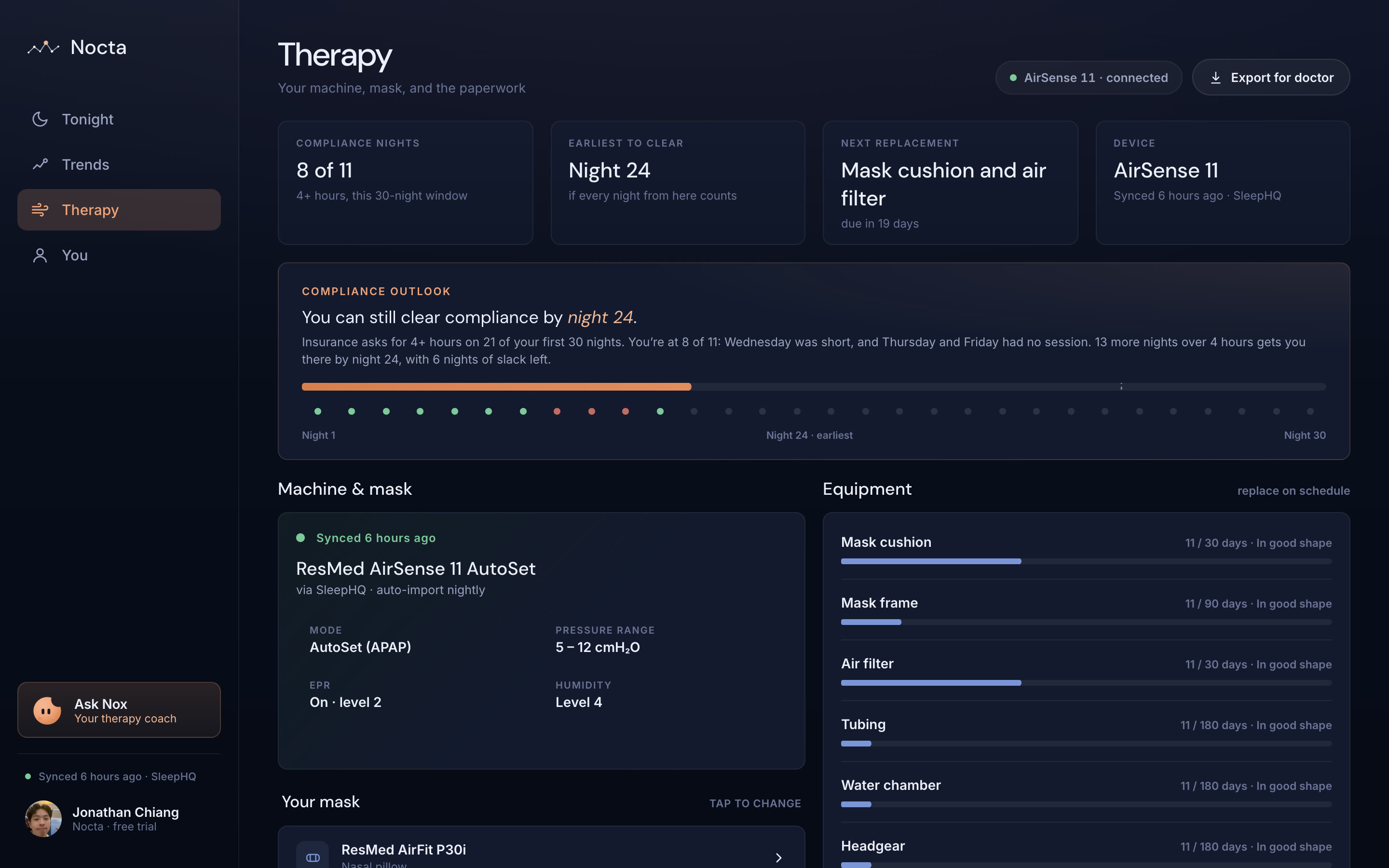
A compliance outlook says plainly whether you can still clear your insurer's bar, and by which night. It's framed as a path forward, never a grade.
Machine settings, your mask and every part's replacement date fold into one line until something is due. One tap exports a clean, AI-free summary for your doctor.
08
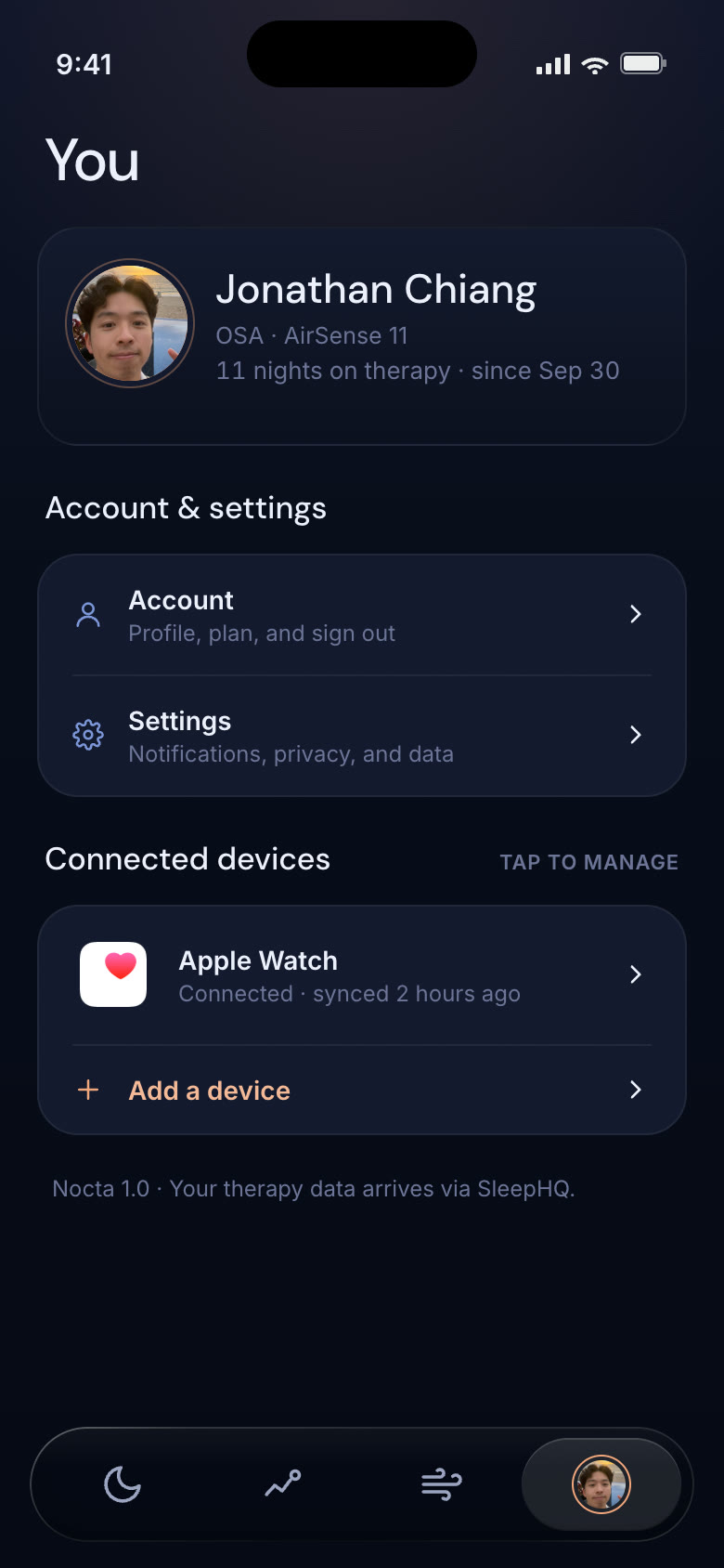
Apple Watch, Oura, Fitbit, Garmin, Samsung and Whoop add heart rate, HRV and sleep stages to the same night as your therapy data.
Connecting runs a full mock OAuth flow: choose what Nocta can read, watch it pull in your nights, and switch any signal off later without disconnecting.
05 AI Safety Rails
The moment an app interprets clinical data, it risks becoming a regulated medical device. Nocta's AI lives inside hard rails: every insight is typed JSON with cited data, a confidence label, and a disclaimer — and certain patterns route straight to “talk to your doctor.”
No “great job!”, no streak trophies. A bad night is named calmly and plainly.
“This pattern often suggests…” — never “this means” or “you have.”
It won't name a condition or recommend a pressure change. Ever.
Central-apnea or SpO₂ patterns trip a physician-referral flag.
06 Testing → Shipped
I ran moderated sessions with five CPAP users on the high-fidelity app. I followed a guided script: no leading questions and no explaining features, just “what do you expect this to do?” Each person walked the whole app: onboarding, the home screen, the morning check-in, a single chart and Trends. Every reaction went on a sticky note under the screen it was about, color-coded by tester.
The testers
I grouped the notes into themes and counted how many of the five testers raised each one. A filled dot means that tester brought it up unprompted.
| Theme | CCody | SSusan | KKathy | MMiles | GGeoff | Of 5 |
|---|---|---|---|---|---|---|
| The check-in is quick, but they wanted richer answers | 5 | |||||
| Leak rate is the number that matters | 4 | |||||
| The best insights say what to do next | 4 | |||||
| One question per screen works, but show the length | 4 | |||||
| A number means nothing without a reference | 3 | |||||
| Best vs. worst night is the comparison they'd use most | 3 | |||||
| Connect the wearables I already own | 3 | |||||
| Encourage me, don't grade me | 2 | |||||
| Pressure belongs to the doctor | 2 |
Insight 5 of 5
Everyone liked how fast the check-in was, and everyone wanted to say more.
“Super quick quiz, very easy to do. Can you select more than one option?”Cody
Shipped
Multi-select answers across four short questions: how you feel, what happened in the night, what you had last night, and what you did yesterday. The first question can be answered right on the home screen.
Insight 4 of 5
Testers kept asking for leak rate, ahead of snoring or pressure.
“Add in leak rate. It's the largest indicator of discomfort.”Geoff
Shipped
Leak leads the “Last night” row, has its own Trends tile, and gets a full page with the 24 L/min line and the minutes spent above it.
Insight 4 of 5
The insights were the favorite part, but a bare number left people guessing.
“Is this per hour? What is this number based on?”Geoff
Shipped
Every headline number now carries its own reference point (“10.5 an hour, up from your usual 4.6”) and exactly one thing to try. Each chart has a plain-language “About.”
Insight 4 of 5
One question per screen felt right, but nobody knew how many were left.
“How many questions are in this onboarding flow?”Miles
Shipped
A step counter on every screen, an “It varies” answer for sleeping position, a wider list of other sleep conditions, and six wearables to connect.
Insight 4 of 5
Testers wanted encouragement, not a grade, and Geoff drew a hard line at pressure.
“Should encourage, and not criticize.”Kathy
“Pressure is medically prescribed, so you can't change it yourself.”Geoff
Shipped
No 0–100 scores anywhere, and a calm voice on bad nights. Ask Nox about pressure and it says that's your doctor's call, then offers to prepare a summary for them.
Responsive by design
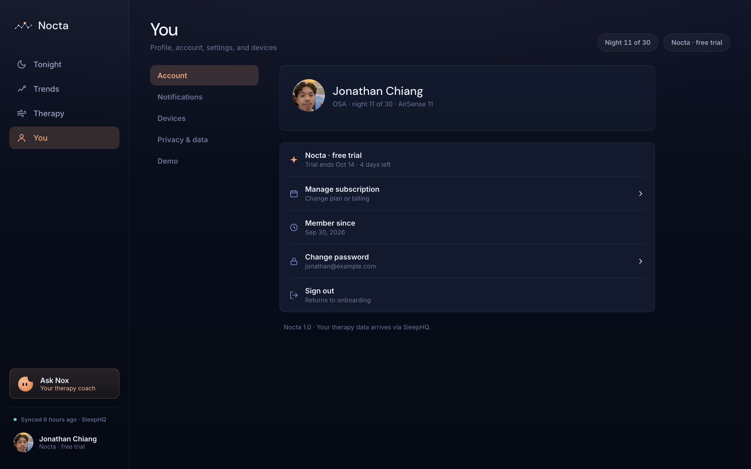
Nocta isn't only a phone in your hand. The prototype reshapes into a full desktop dashboard — a persistent sidebar, the nightly story as a hero, and every chart given room to breathe across a two-column layout. Same data, same calm voice, more space to explore.
Side by side
 OSCAR
OSCAR
07 Impact & Measurement
by translating raw CPAP data into personalized, plain-language insights people can understand and act on.
by helping users see what's working, what's not, and the one adjustment worth trying tonight.
through gentle, honest habit-building that keeps people on therapy past the month that usually breaks them.
Nocta isn't a live product yet, so I won't claim results. If I launched it, these are the numbers I'd watch. I'm not optimizing for time in the app; I'm optimizing for time on the machine.
North star · Day-30 compliance
How many new users meet the insurance standard (4+ hours on 70% of nights) in their first month. The research showed the first month predicts whether someone is still on therapy two years later.
Core idea · Follow-through
Whether people actually try the why horizon's suggestion, and whether their next night improves. That tells me if interpretation over data is working.
Success signal · Fewer suggestions
If therapy is working, Nox should have less to say. Fewer suggestions paired with steady compliance is a sign of success, not disengagement.
Guardrail · Harm
How often a “talk to your doctor” alert was actually warranted, and whether people quit after a hard message.
With a full team, I'd validate it in phases
Beyond the design, I built a working React prototype — running on my own CPAP data, every chart rendered with Chart.js, and AI insights shipped as typed JSON ready for OpenAI's Structured Outputs and the SleepHQ API.