SkillCat · Online Learning
An all-in-one HVAC learning platform.
One platform, two surfaces; the consumer mobile app learners use to earn a credential, and the B2B web dashboard employers use to train their teams.
SkillCat is a skilled-trades training platform: people learn HVAC, electrical, or plumbing to earn the certifications that get them hired, and employers use it to train their teams.
I worked across both surfaces as a product designer (the mobile + desktop learner redesign and a new admin dashboard for employers) and wrote the specs that translated those decisions into something engineering could build.
01 · The Starting Point
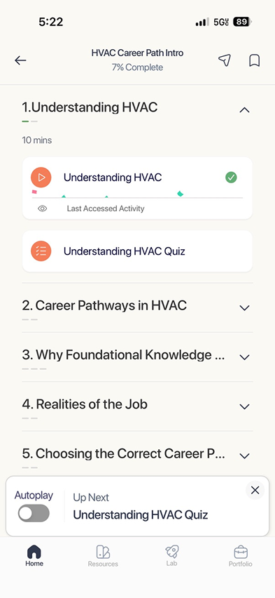
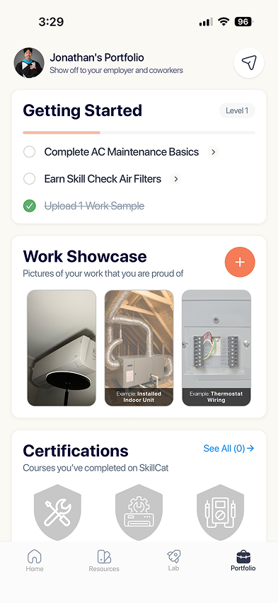
Original app: deep catalog with no clear path.
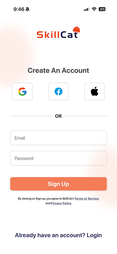
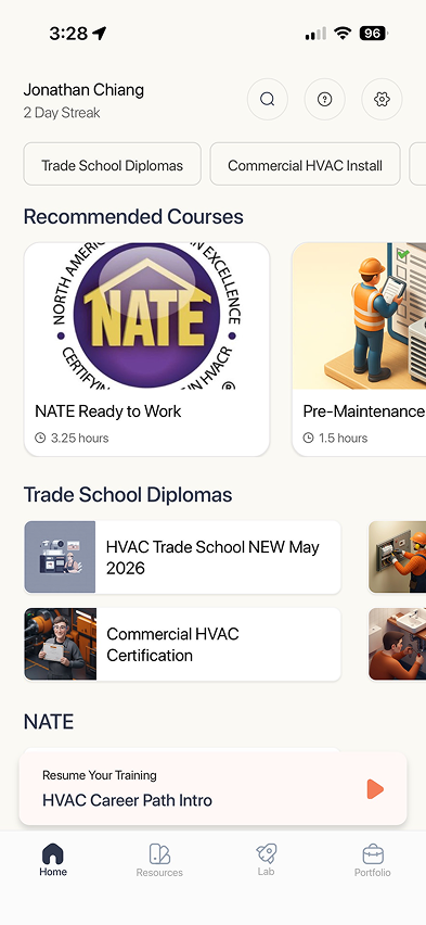
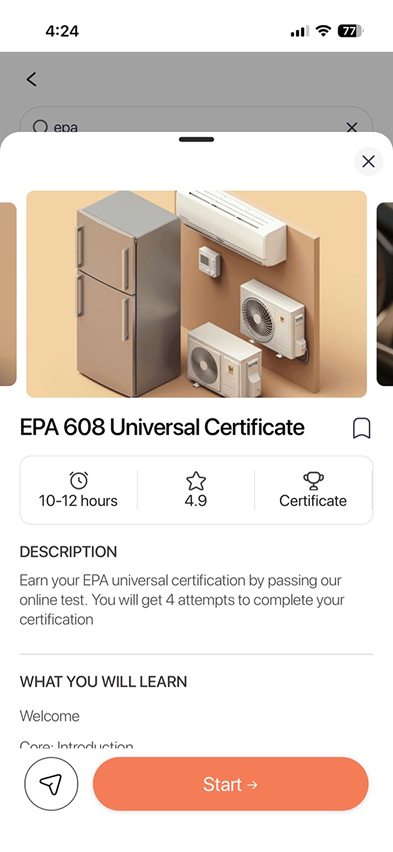
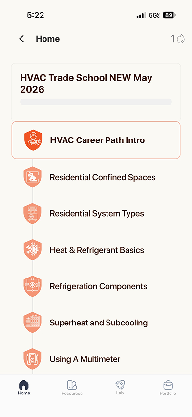
What wasn't working
- 01
Catalog-first: learners landed in categories (EPA 608, Trade School Diplomas…) with no guided path.
- 02
The credential that gets you hired was hard to find among everything else on offer.
- 03
Little sense of progress or "what's next": easy to enroll, easy to drift.
- 04
A five-tab nav (Social, Skill Check, Class, Simulations, Profile) split attention away from the goal.
02 · Research & The Landscape
Trade learners are outcome-driven.
Trade learners study HVAC, electrical, or plumbing to earn a certification and a better paycheck, often early-mid career and learning on the job. Step one: get the vocabulary right (OJT, EPA 608, HVAC) so the product sounds like the trade, not edtech.
Talking to the trades
~30/day
Trade workers & active users texted, every day for two weeks
100%
Async by design: replies came on their own time, between jobs
2
In-depth Zoom interviews for the full story
What I heard
01
Outcome-driven
Get the cert, get the job, get the raise. Learning is a means to a paycheck and seniority, not points or streaks for their own sake.
02
Learn by doing
Skills come from the job, plus YouTube, manuals, Reddit, and a mentor. Formal school is slow and pricey, and "archaic" videos lose them fast.
03
"...then what?"
The loudest anxiety: does finishing the courses actually get me hired? The path from learning to resume to job isn't closed in their heads.
Where the market sits
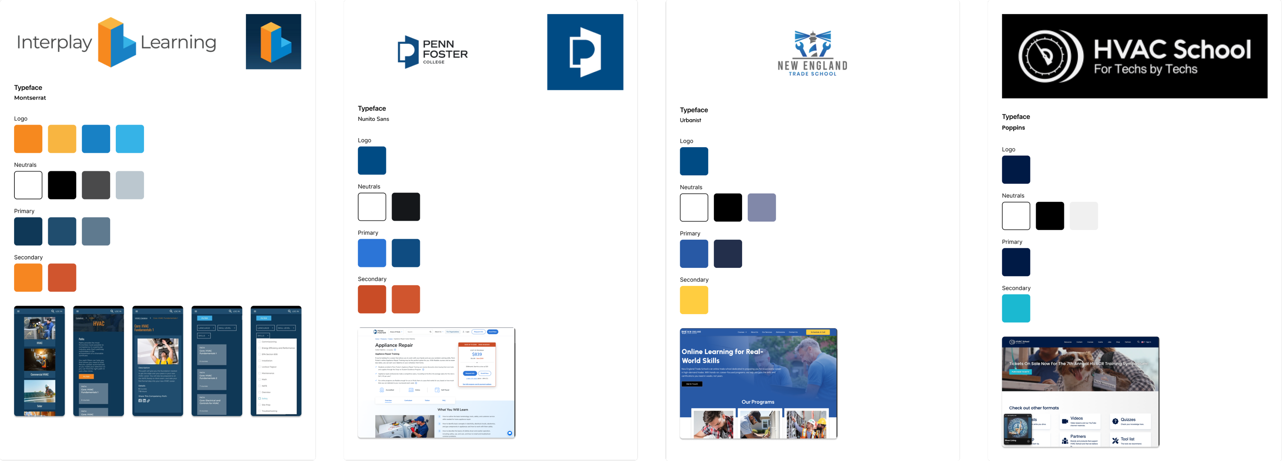
Direct · trade schools & cert providers




The opening

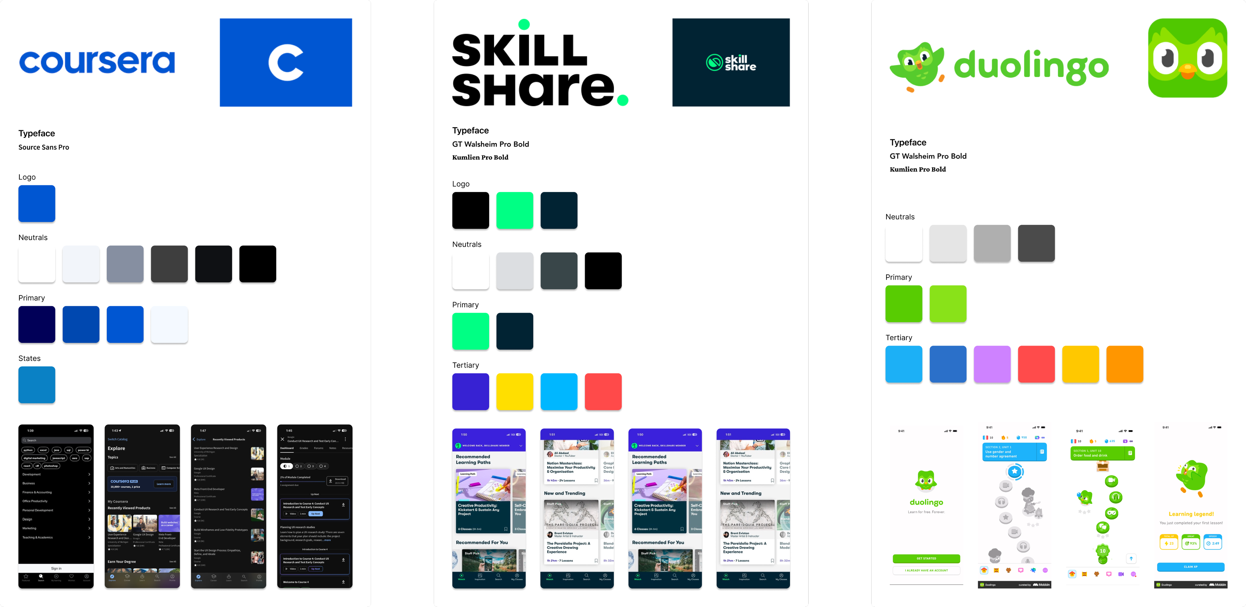
Indirect · consumer learning apps



Direct, trade schools & cert providers: logos, type, palettes, and product screens.
Indirect, consumer learning apps: logos, type, palettes, and product screens.
03 · Finding The Brand
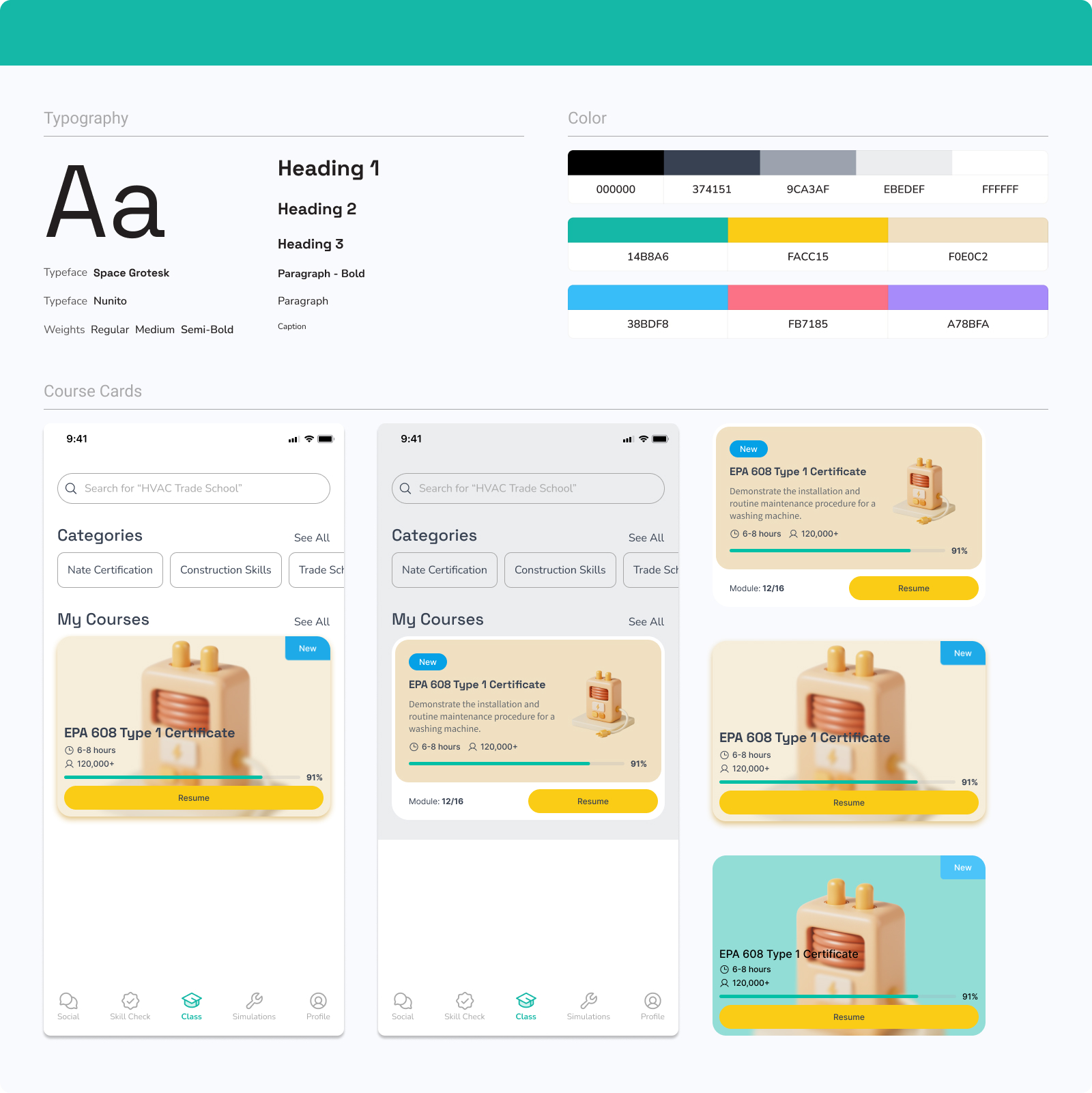
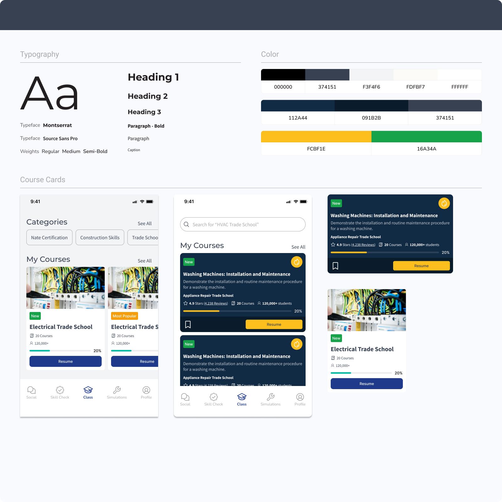
Three brand directions explored
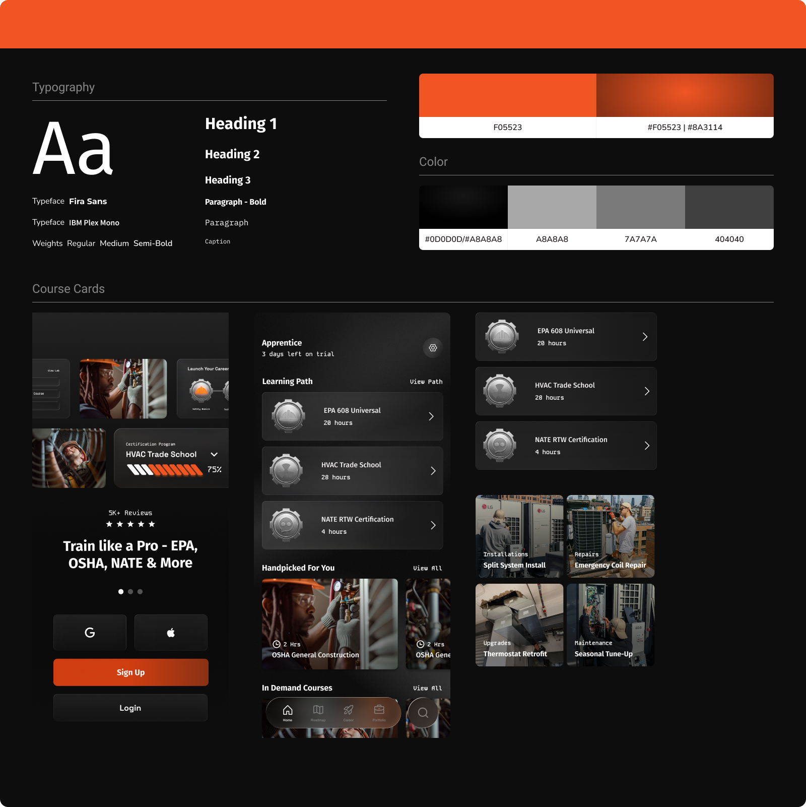
The chosen system
SkillCat, An all-in-one HVAC learning platform.
For $10/month- Access Self-Paced Trade School Programs & Certifications designed to get you job-ready in just a few weeks
Badge — six iterations






The Redesign

04 · Iterating The Experience
4 main iterations: what changed at every step.
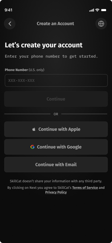
Onboarding shifted from a form-first signup to a few guided questions that build a personalized path. Home shifted from a flat catalog to a clear "path to a paycheck." Each round cut friction and made the next action harder to miss.
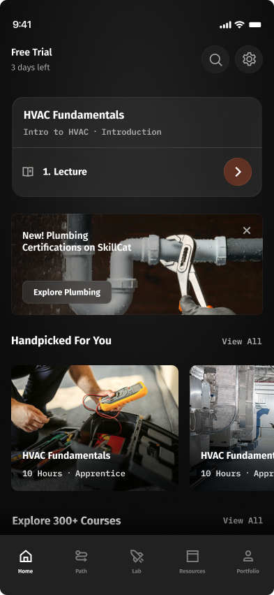
Home
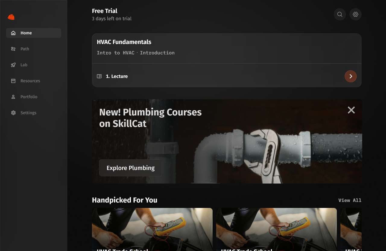
The home screen shows learners where they are and what to do next.
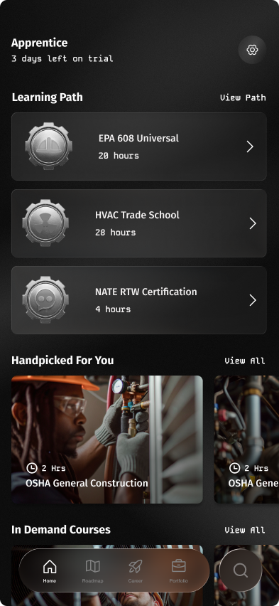
- Learning plan cards are too tall.
- What if a user has 5+ learning plans? Stacking on the home page overflows.
- Navigation bar is modern but runs into legibility issues.
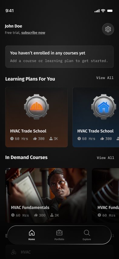
- Learning plans now look visually different from regular courses.
- Simplified the learning path: one single path stacked on the backend.
- Simplified the navigation bar.
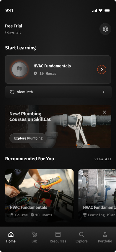
- Simplified the header billing status.
- Simplified the iconography.
- Added a full-width banner for new courses.
- Reverted to a traditional navigation bar.
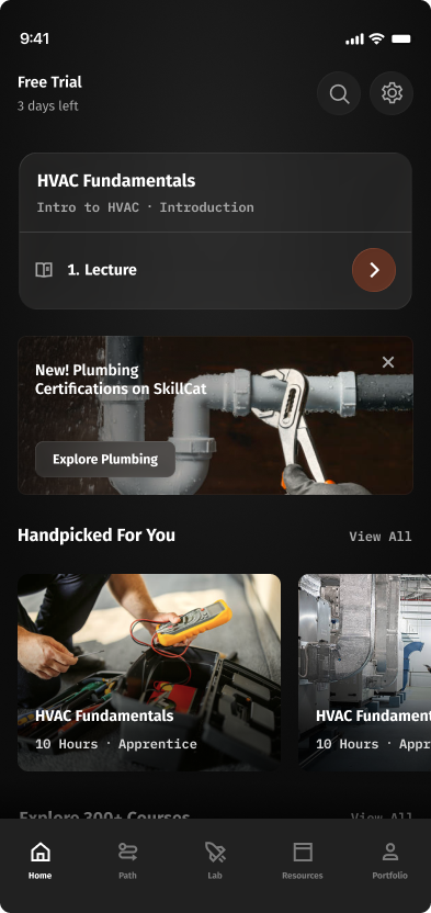
- Moved Search up into the header.
- Collapsed Start Learning into one card with the course + current task title.
- Added "Path" to the nav: direct entry to the Course Tree.
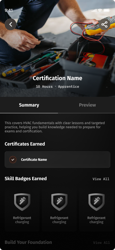
Course overview
The course overview explains what a course covers before a learner starts it.
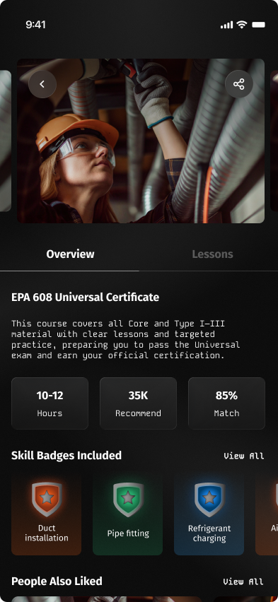
- Added Overview and Lesson tabs.
- Can cycle between courses like the original screen.
- Included hours, recommended, and match stats from the original.
- Skill badges in various colors.
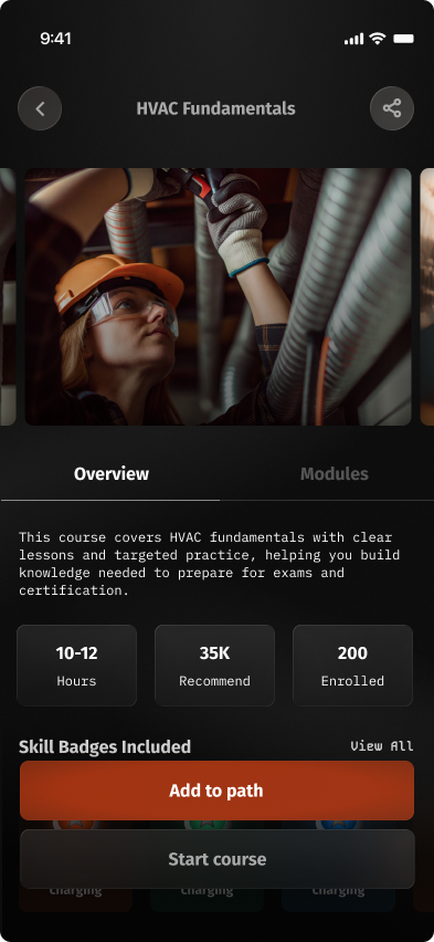
- Moved course title + buttons to the top of the page.
- Kept the course cycling feature.
- Replaced Match % with # enrolled.
- Pulled CTAs into the bottom of the viewport so they're always visible.
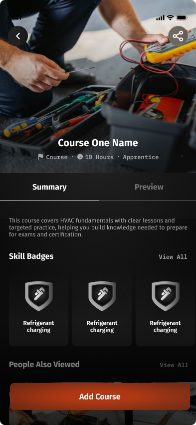
- Course image now takes the full width of the page.
- Title and stats moved inside the course image.
- Removed the course cycling feature.
- Simplified the badge colors.
- Combined Add to Path + Start Course into a single Add Course button.
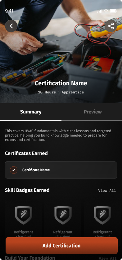
- Changed copy from "Course" to "Certification."
- Removed the course name from the stats block.
- Surfaced the awarded certification(s) upon completion.
Portfolio
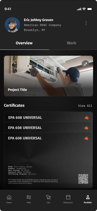
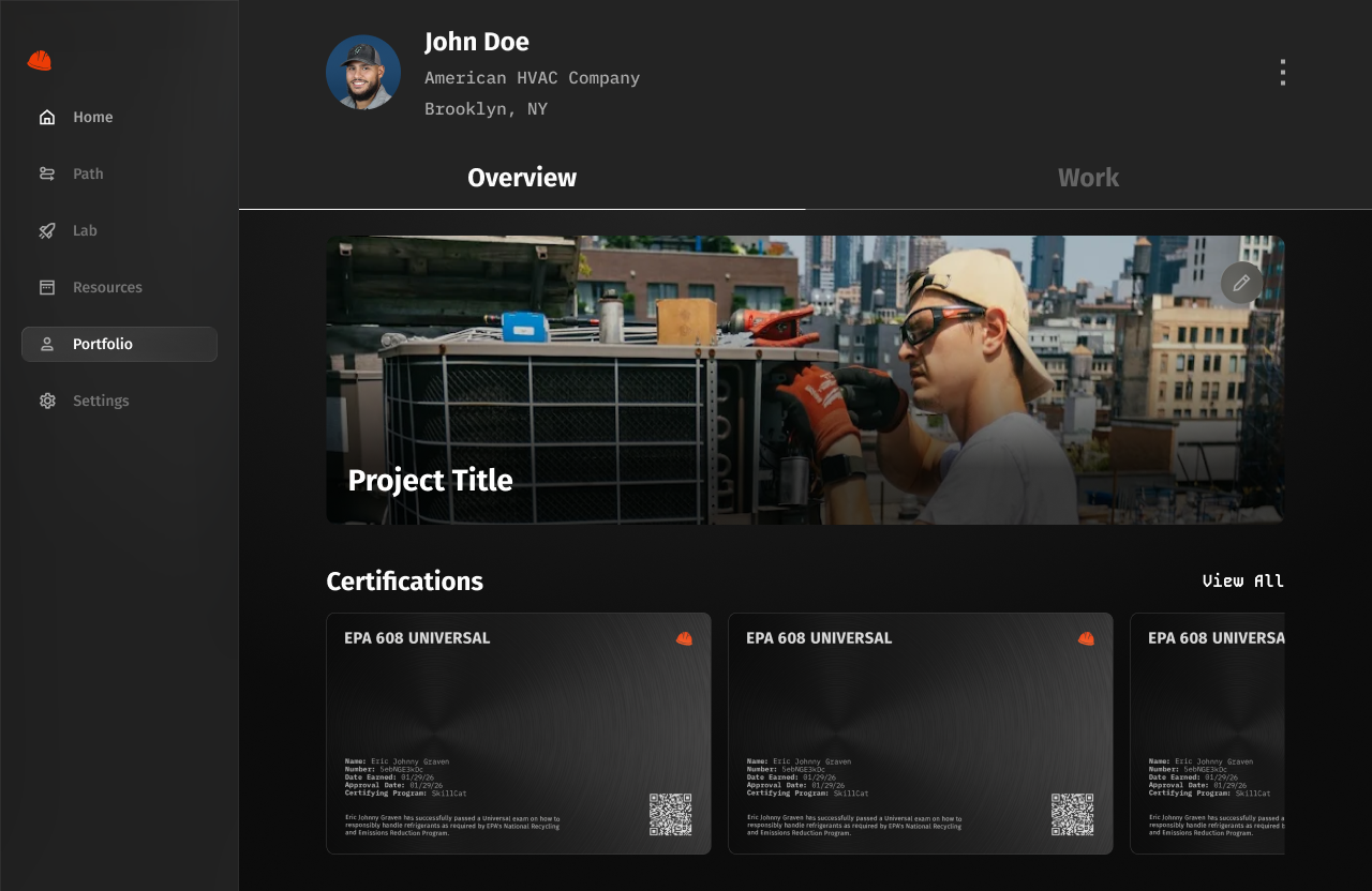
The portfolio collects a learner's earned certifications and courses in progress.
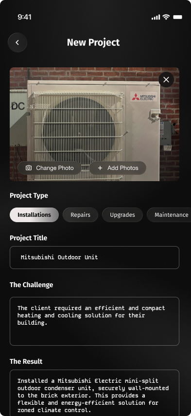
- Large photo card up top.
- Options for selecting a project type.
- Project title, challenge, and result are all typed in manually.
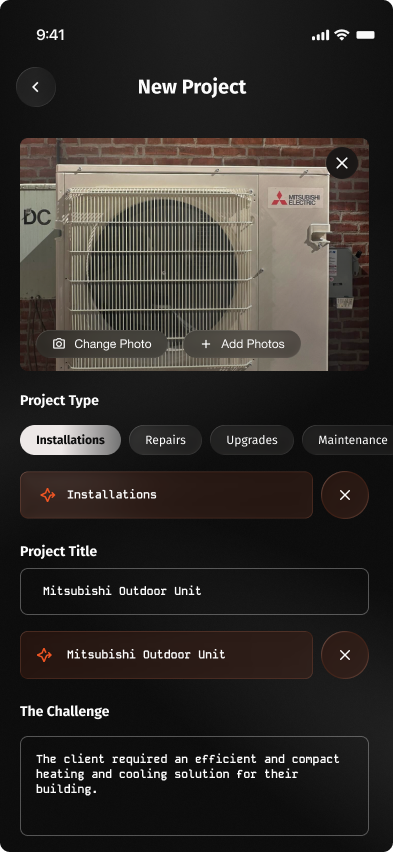
- Added AI suggestions to speed up entry.
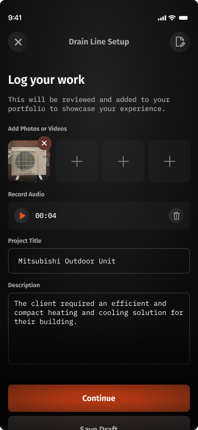
- Project type is now selected before starting: the flow is gated upfront.
- Photos take a less prominent role.
- Added audio recording.
- Removed the challenge and result fields.
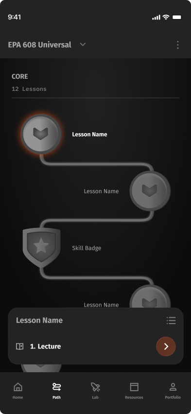
Course view
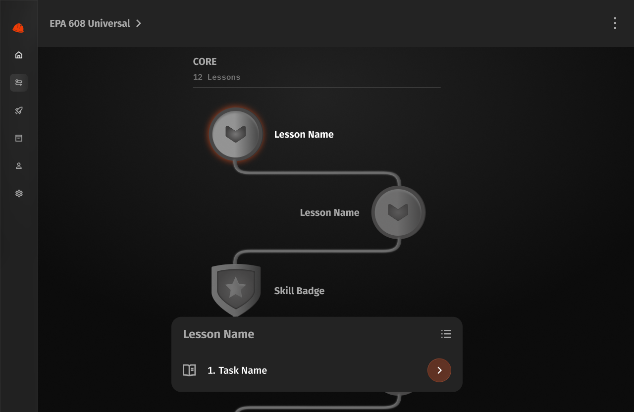
The course view lays out a course's lessons and tracks progress through them.
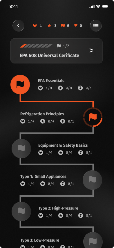
- Progress noted on the top banner bar.
- Military motifs gamify the path: badges, trophies, streaks.
- Each node = a full course, with all sub-tasks, quizzes, and finals listed inside.
- Users must complete every step before moving to the next node.
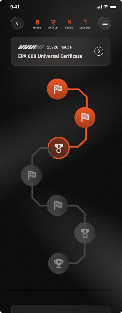
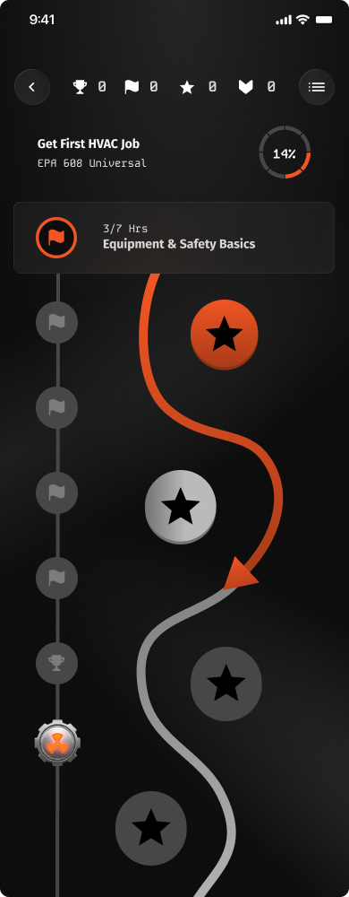
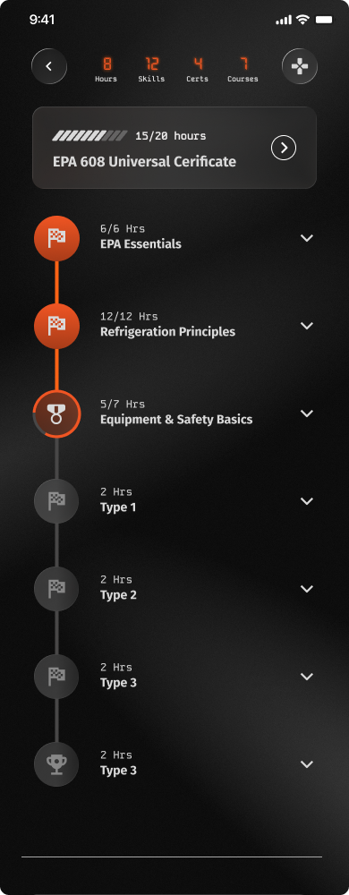
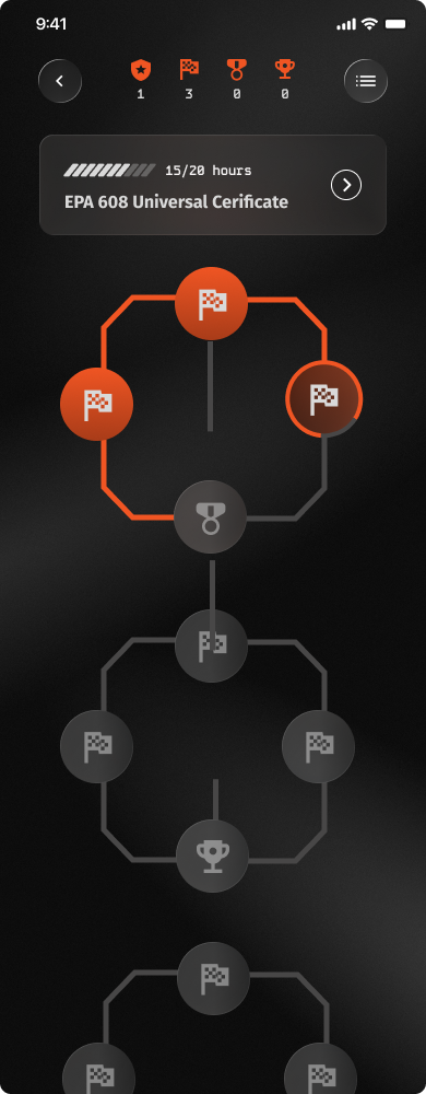
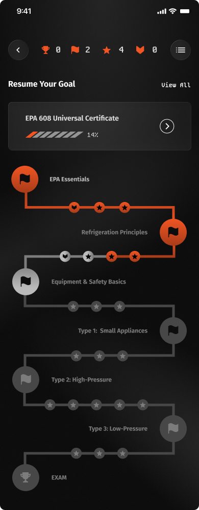
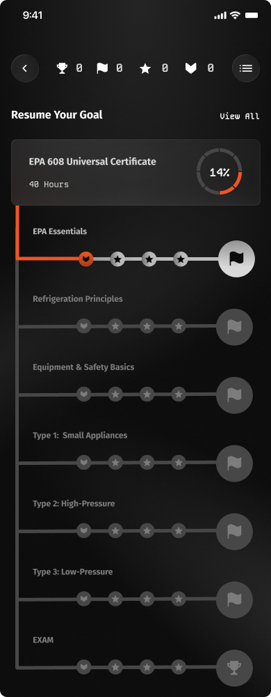
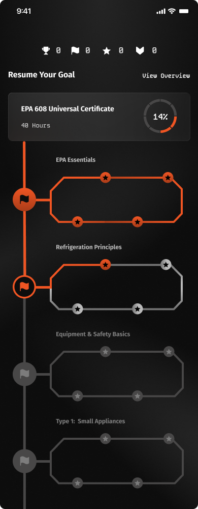
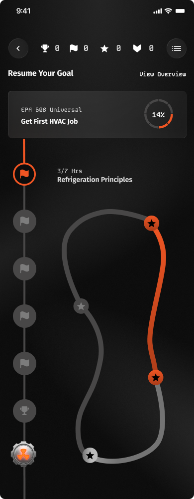
Zig-zag path of nodes, stats bar on top.
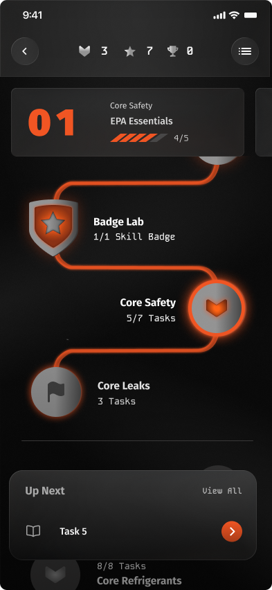
- Updated the course tree UI.
- Simplified the trophy system.
- Each node now = a single lesson with its tasks inside.
- Added a bottom modal for more info.
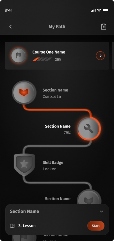
- Banner now includes the user's progress.
- Removed the gamifying features.
- Simplified the node descriptions.
- Simplified the header: now shows the certification name.
- Removed the top banner entirely for a simpler section header.
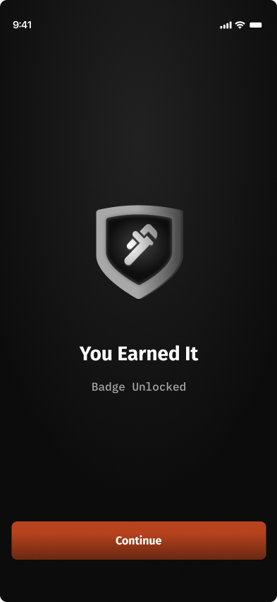
Task Completion
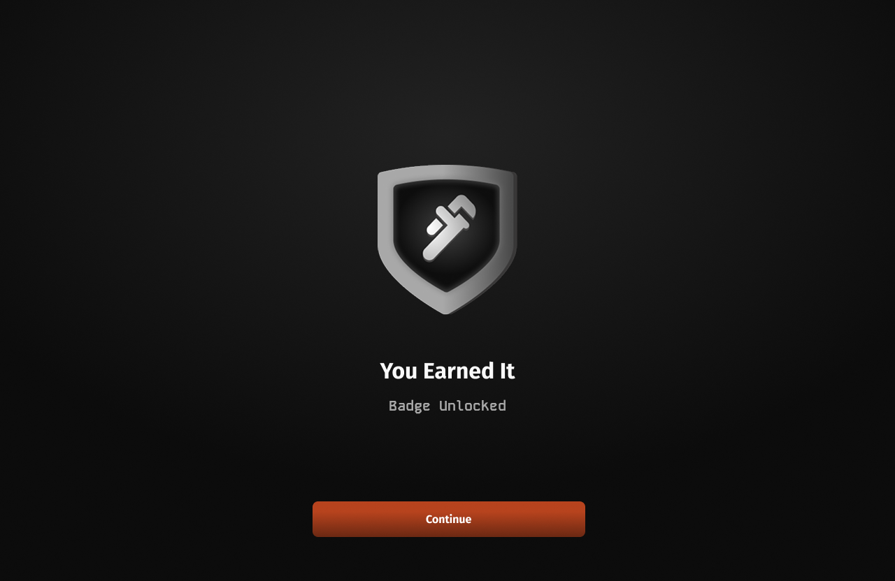
The completion screen shows a learner their exam result and certificate after they pass.
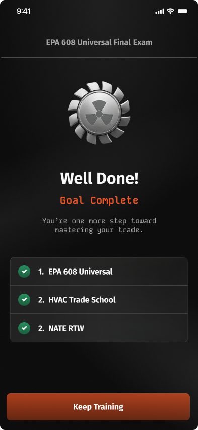
- Large success badge as the hero.
- Checkmarks for each completed step.
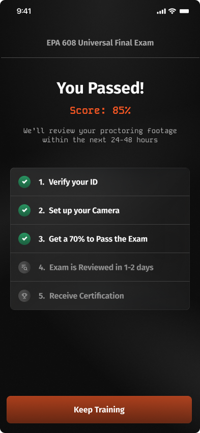
- Removed the large badge.
- Surfaced the exam score.
- Added more steps to the completion status: reviewing results and receiving certification.
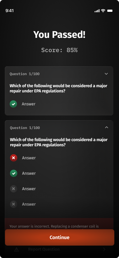
- Removed the quiz / exam title.
- Moved the checkbox steps to a separate page.
- Added a review section covering all questions.
- Renamed "Keep Training" to "Continue" (same destination).
05 · Testing & Insights
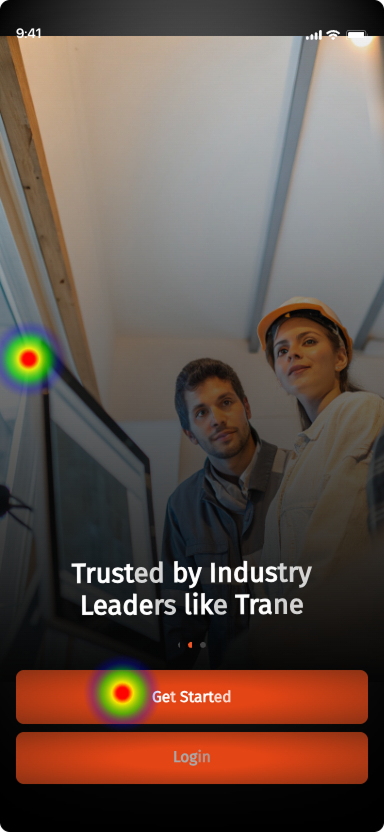
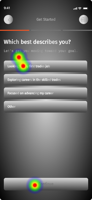
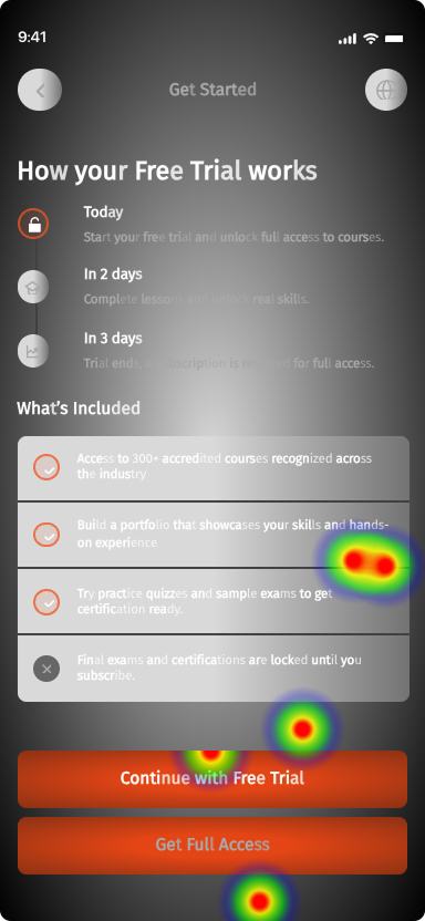
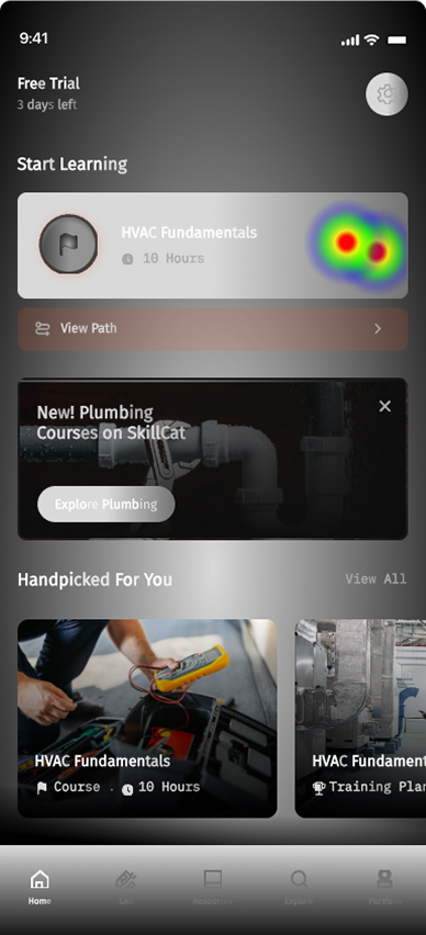
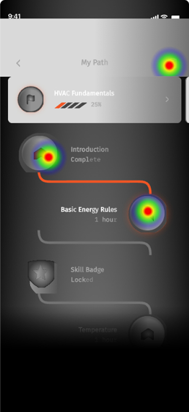
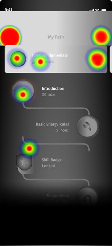
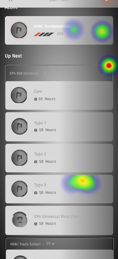
Heat Map Testing: 7 participants, 3 flows, and one clear weak point.
An unmoderated Maze study, 7 participants, three core flows: Create Account, Start Course, Edit Path. Starting a course landed cleanly. Editing the path broke down.
Insights
Tree-map nav isn't intuitive
Users weren't sure where to start, or how to preview a path before committing to it.
They click everywhere but the path
Most users hit the nav bar or home course cards before they ever found the path module.
Mobile stalled at Edit Path
Path flows froze and reloaded on mobile. A Maze prototype flaw, but it cost real frustration.
Swipe-to-remove stayed hidden
Some users tapped path cards over and over before discovering the swipe-to-delete gesture.
Potential fixes
Teach the path on arrival
A short first-run walkthrough of the tree map, so the structure clicks before users dive in.
Strengthen the first step
Boost the CTA on the first course module so the starting point is impossible to miss.
06 · The Learner Redesign
Carry a learner from adding a course to earning an EPA 608 certification.
Before & After
Full redesigned comparsion
07 · The Admin Dashboard
Valuable insights for admins too
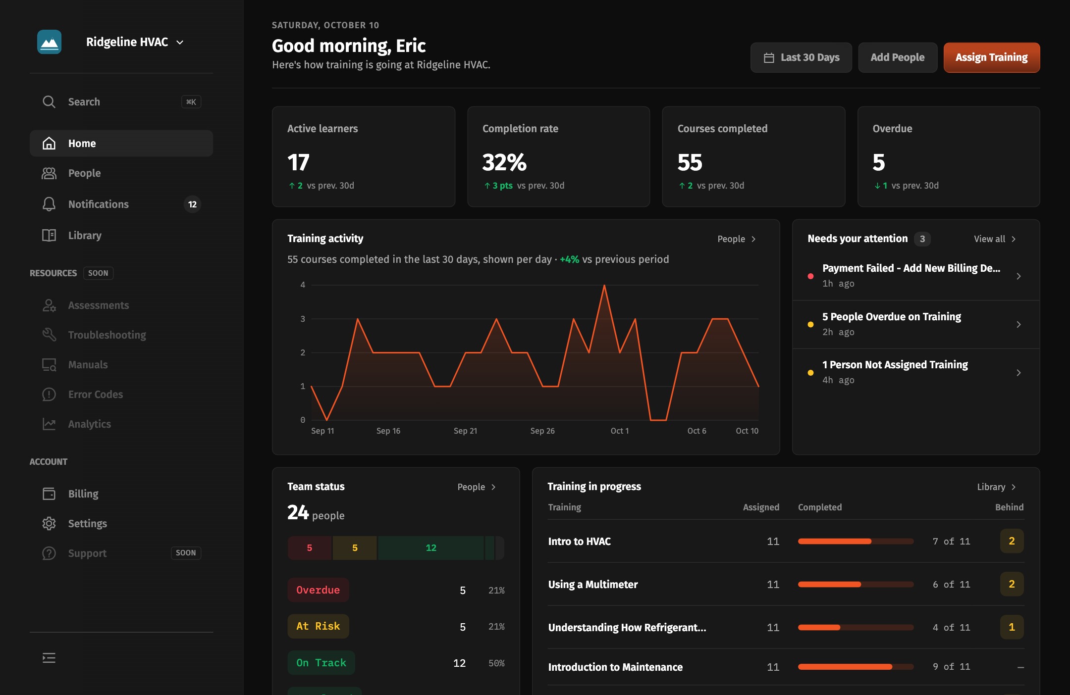
I helped redesign the employer side as a full dashboard for running training across a team. Assigning courses was reframed from a flat list into a structured plan: pick employees, stack courses in order, set a due date on each.
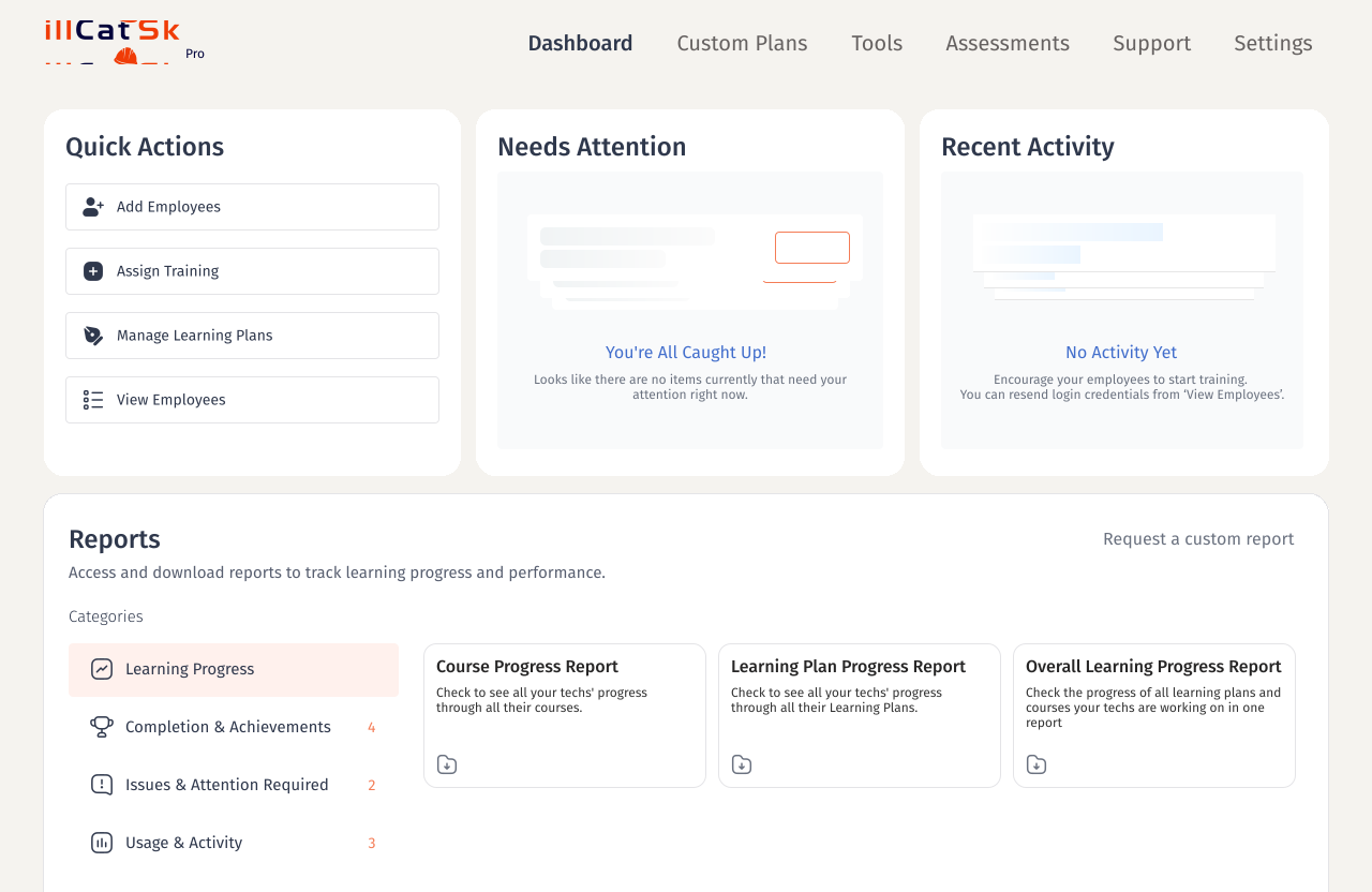
Home
Where an admin lands. V1 was a static grid of quick actions and reports; the redesign turns it into a live overview of team training that admins can customize.
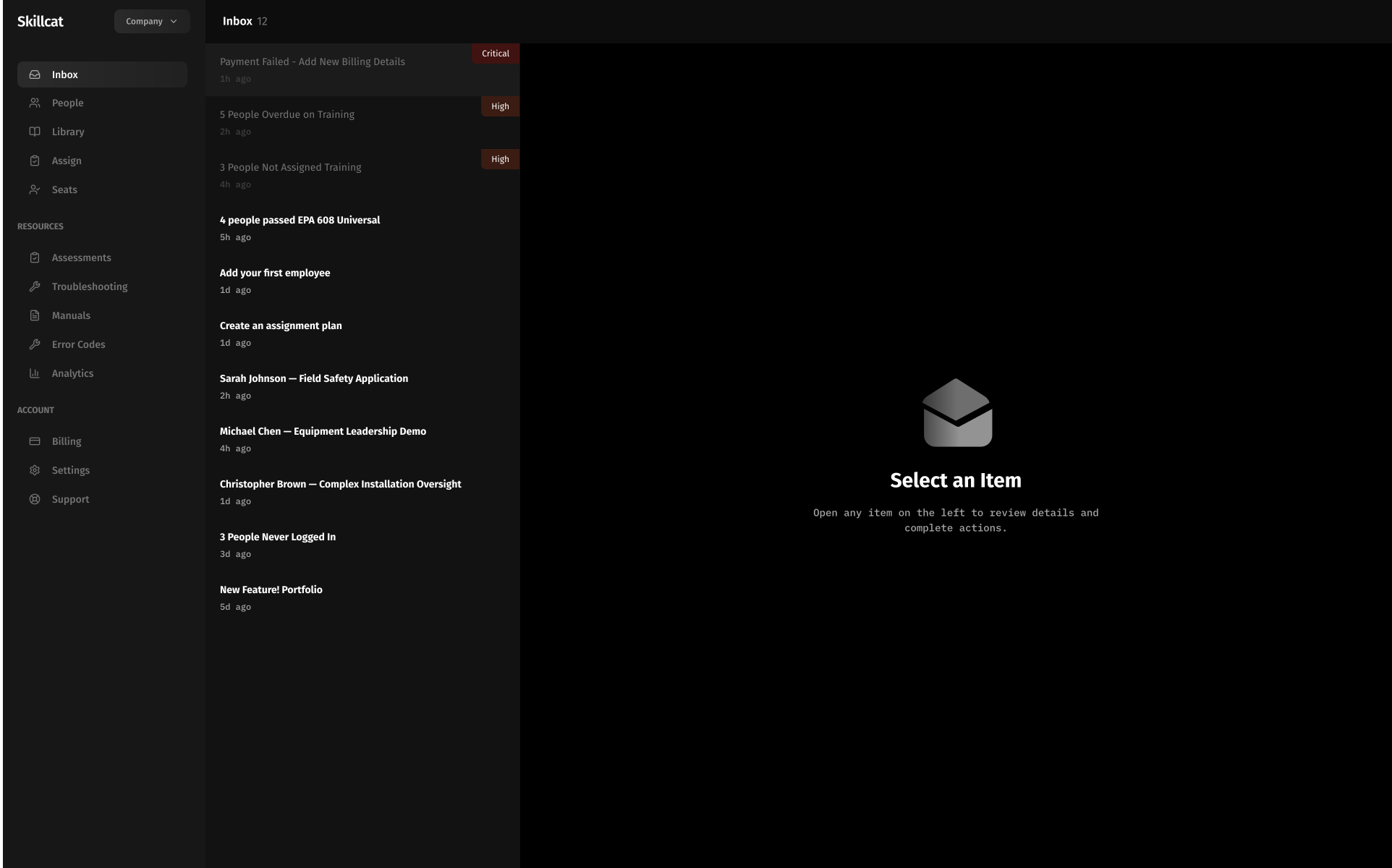
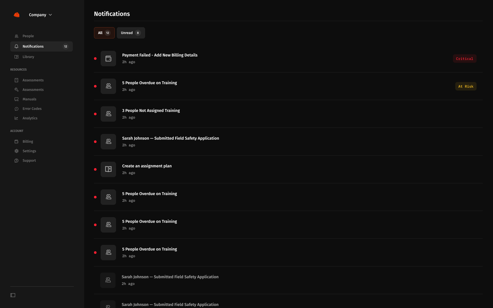
Inbox
The admin's command center. Every approval, assignment, and pending action lands in one role-aware queue.
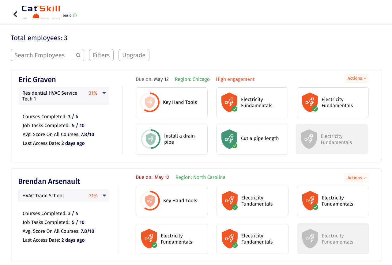
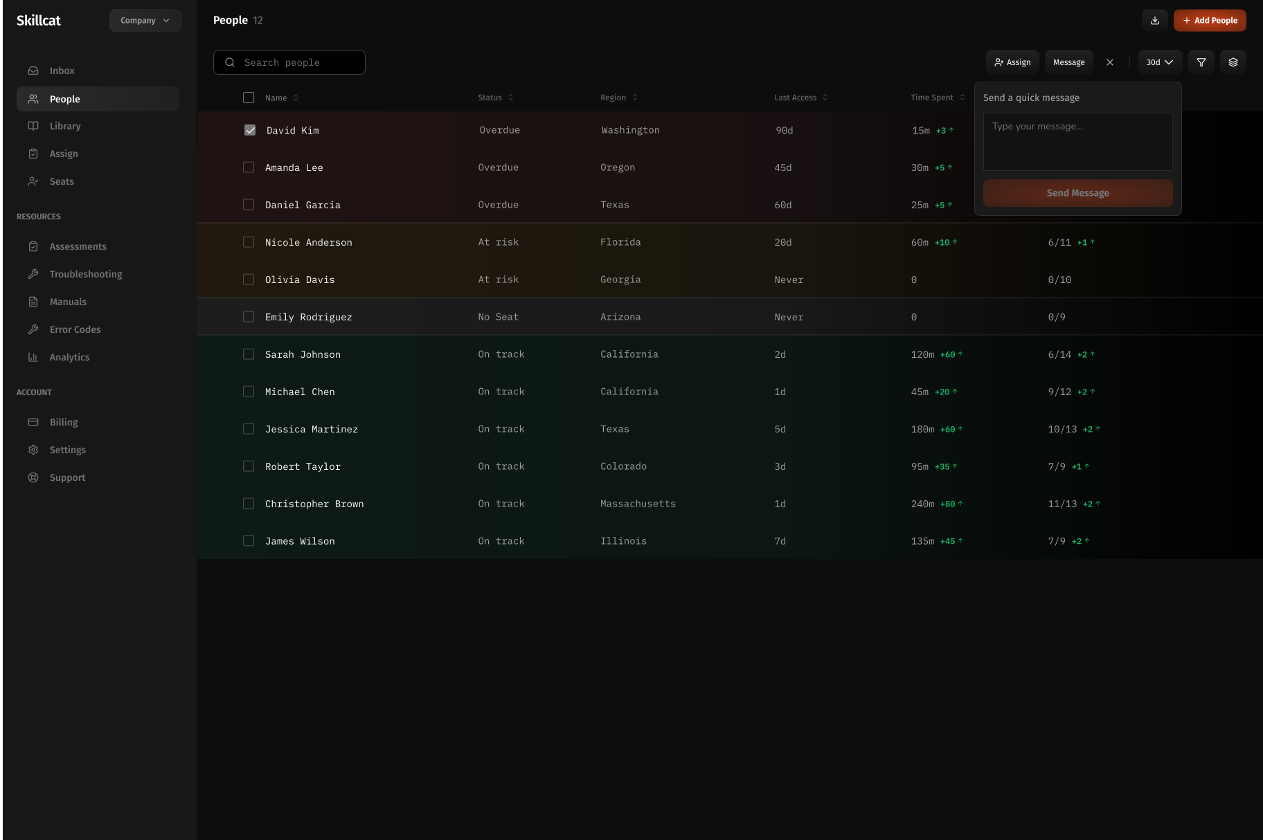
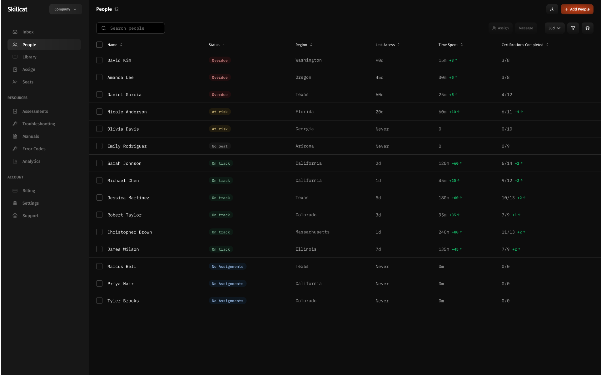
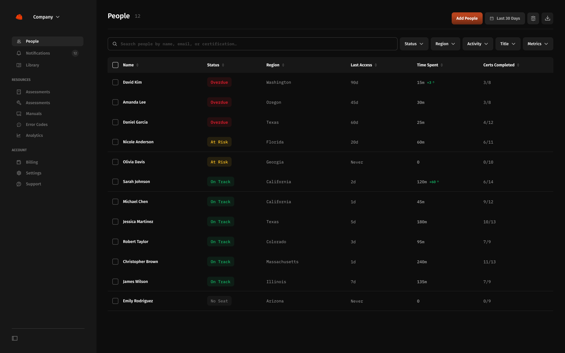
People
Managing the whole team: roles, progress, and bulk actions. Each round pushed it to scale well past a handful of employees.
08 · Feature by Feature
Team summary to grading the work.
09 · Reflection
01
A design is never done
Several times we thought we had the final iteration, then testing with more users surfaced new ways to improve. I learned to treat iteration as continuous and never settle on a design as finished.
02
Designing and coding at the same time
Prototyping in code while designing often showed me a screen was too complex to build, or that transitional screens were missing entirely, since our visual designer focused on the core screens. Raising these with the team before engineering handoff headed off problems and sped up the product lifecycle.